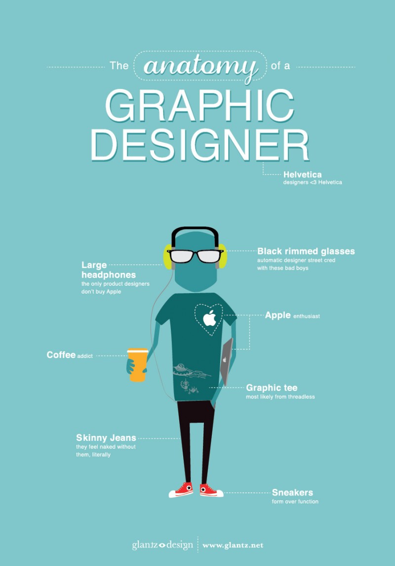
First, there is a really nice infographic about graphic design:
Tipp #1:
Alignment is a very important aspect of design. By aligning your elements to eachother it represents organisation and orderliness. But you can also break the rule of alignment just to draw more attention to important elements!
Tipp #2:
In designs balance can be more than weighing. Also it can not only be on side to another but it can be radial, symmetrical or asymmetrical. Just balance your elements to get a structure of your design and to draw attention to specific elements.
Tipp #3:
The use of color has always been a way to demonstrate importance. Use colors to draw attention to specific elements but don’t forget to see the colors contrasts! Contrasts draw only more attention to elements and can also be used for connections between some elements. But be careful using contrasts in texts or messages – sometimes it can affect illegibility.
Tipp #4:
Repetition of elements or structure can easily get a nice effect on your design. But on the other hand it can have undesired effects if repeated elements are used carelessly. For your design, repetition can draw attention to important elements and help the user to get orientation. The most important fact is that repetition represents a constancy in design.


