If you don’t change with the times, the times are going to change you.
We live in a fast-moving world that brings continuous change in many areas. This also applies to design in particular. But unlike in the past, when there were regular major design trends, today’s world is characterised by a mix of styles that can be used flexibly, mixed in new ways and where you get the feeling that just as one style seems to be gaining a little broader acceptance, a counter-trend is already coming.
In today’s design, somehow everything is possible and trendy:
There are no design limits; depending on the brand and product, any style can be used flexibly.
Perhaps this characterises today’s (design) era best: any style is possible, and it is precisely the simultaneous presence of counter-trends that makes them so appealing.
A look at the design trends is therefore not a nostalgic one along the lines of „the good old days“. The following design trends – although most of them originated in earlier years – are timelessly applicable.
It is therefore not so much a question of what is currently in fashion or what could be in fashion in the future, but rather what style suits the product and the desired effect.
Table of Contents
Classic graphic design styles
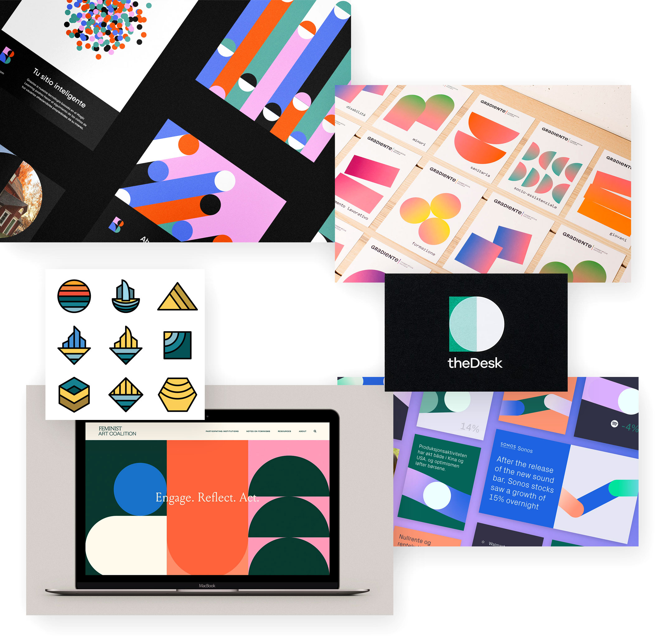
Geometric shapes
Basic shapes are the beginning of everything – at least the basis of every design. The document is already rectangular, monitors are too, packaging and print publications are also usually rectangular.
So every design is based on the basic shapes circle, rectangle/square and triangle (or polygons in general). And although one might think that these simple shapes would be inappropriate for design because they are too commonplace, exactly the opposite is the case. They produce a reduction like no other design element. In addition, the design with the basic shapes is anything but simple in the sense of simplistic. A harmonious composition also requires work and experience with them.
And at the same time, the basic shapes are enormously expressive; many logos use the circular shape, for example. Harmony, reduction and recognition can be found in these shapes.
Liquid design
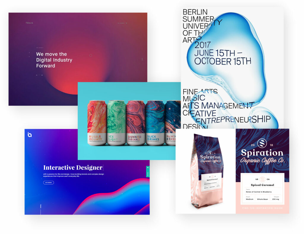
In contrast to the geometric shapes are the „fluid“, flowing forms. Without hard edges, these designs appear softer and more dynamic as well as more creative and adaptable.
The shapes and thus the designs appear more organic, less constructed.
Liquid design
Liquid design in use:
As here, among other things, in packaging design, websites or posters.
Off the grid
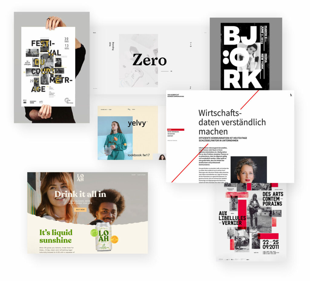
An (invisible) grid helps to position the elements so that they are flush. In print and web design, these grids are a helpful design tool. The result is symmetrical and harmonious layouts.
But it is precisely the breaking of this symmetry that can lead to individual layouts. It is not a matter of an arbitrary or chaotic arrangement, but of deliberately turning away from individual elements. In other words, a partial asymmetry.
This makes designs more striking and memorable. With these broken-grid layouts, designs can be loosened up and thus appear more striking, more memorable and stand out from the crowd.
Broken-Grid Design
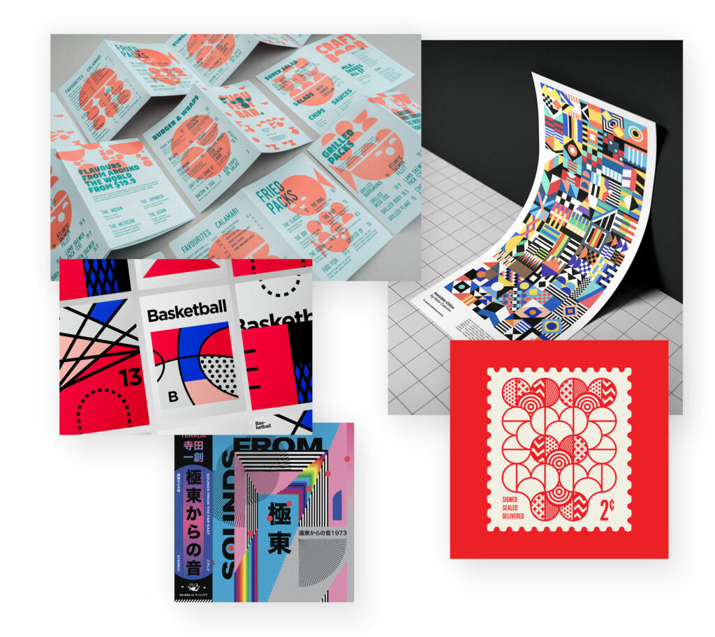
Abstract geometry
There are designs with clear lines and edges, Bauhaus-style in feel. These already result from the digital tools and their rectangles and circles.
As a typical counter-development, colourful, „wild“ shapes are then often used in a free arrangement. In a playful-abstract way, the elements lie in the layout, free of any grid, often overlapping. This has a modern-creative effect.
Abstract Geometry Design
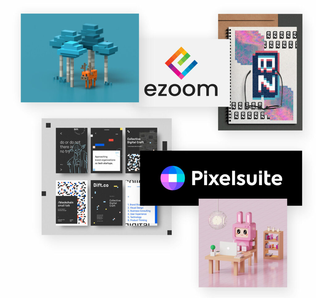
Pixel Art / Voxel Art
The pixel is basically the smallest digital design unit. And no „design element“ stands more for digital development and digital design.
So why not make „pixel art“?
Sure, we can’t see the individual pixel (except for that one damn pixel error in the monitor). But to „artificially“ enlarge the pixels in order to use them as a striking design element, this is a clever self-reflection of the medium with itself.
The implementation can be two-dimensional (pixel) or three-dimensional (voxel). In any case, such designs have a modern, digital character.
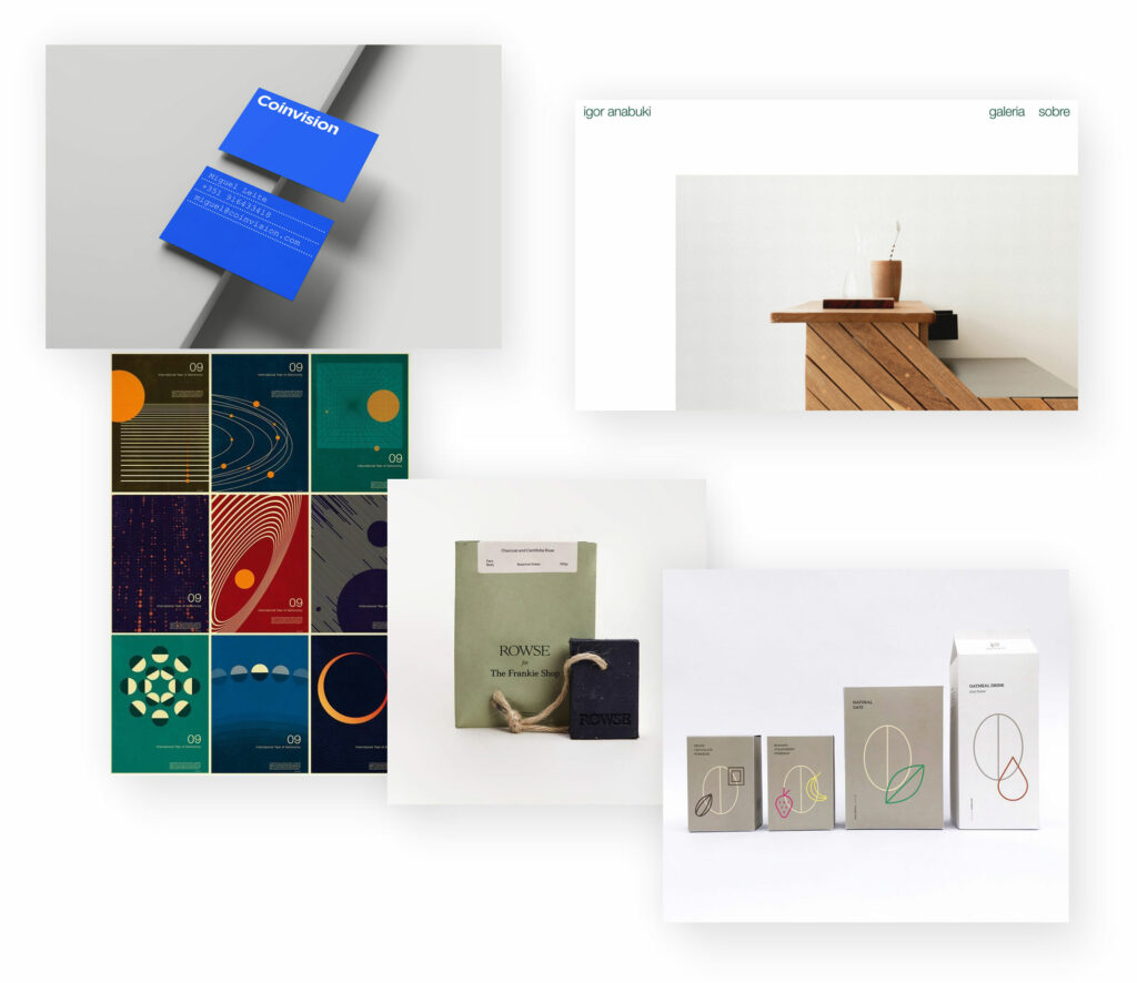
Minimalism
Reduce to the max – The omission of almost all design elements until only the most important remains. This is the fine art of minimalist design. And at the same time, in a highly complex world full of visual impressions, a real relief.
In addition, minimalist designs appear very powerful and forceful precisely because of their reduction. And there is often a high-quality, elegant effect on top. With minimalist designs there is no danger of the design distracting from the content, on the contrary: it rather supports it.
Most of the time, these layouts are also characterised by black and white contrast, but they don’t have to be. Coloured tones can also have a minimalist effect if they are used sparingly.
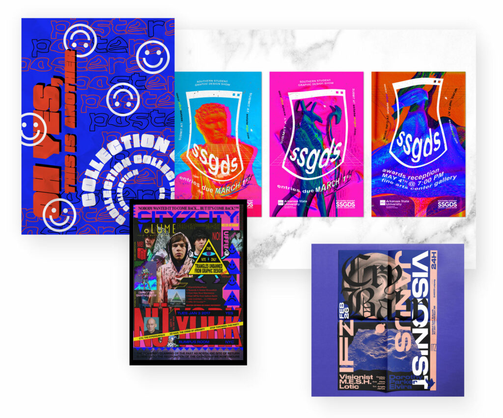
Maximalism
The opposite of minimalism is maximalism. Instead of „less is more“ or „reduce to the max“, it is more „a lot helps a lot“ or „go big or go home“.
Many design elements, all kinds of design styles mixed together, little symmetry, everything overall rather inharmonious – this is the maximalist design style. Like effect is loud, bold, chaotic, demanding and dynamic.
Attention is guaranteed with such an intrusive design. The danger here is that the effect turns into the opposite and the viewer quickly gets fed up and looks for a calm visual balance.
Maximalism Design
Brutalism
In architecture, this refers to a modernist building style from the last century that relies on the extensive use of exposed concrete. A pretty-ugly architectural style.
In graphic design, this style is adopted with a raw, partly unfinished effect. Without ornamental embellishments, large, striking design elements meet, overlap and create a hard, concise effect – just like concrete buildings in architecture.
Robust, present and somehow appearing bare and unfinished – Brutalism is not for delicate, light associations.
Brutalism Design

Symbols
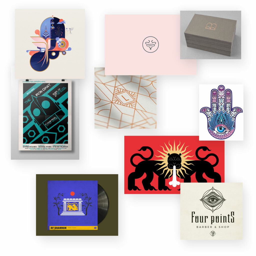
Symbols are among the earliest evidence of mankind. Already in cave paintings – from today’s point of view – simple signs were created. Over the thousands of years, symbols have evolved that often have a spiritual, sacred, generally emphasised meaning. These are mainly found in ideological, astrological, psychological or theological areas.
In design, symbols can also be used to convey a kind of special meaning. It has almost something like a „secret society“ and stands for creativity, transcendence, higher experience and power. And at the same time also for something unifying, communal and hopeful.
Symbols design style
Optical illusions
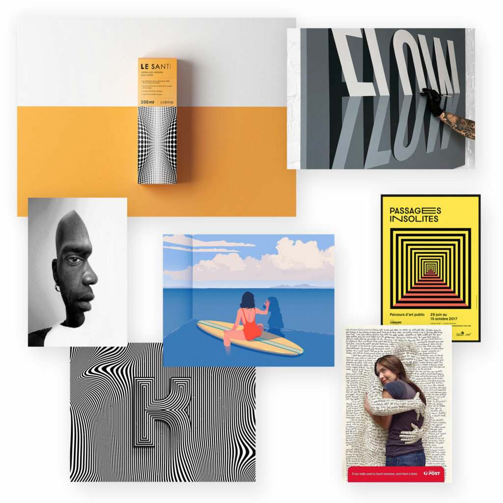
Optical illusions are wonderful for attracting attention and confusing at the same time. Everyone knows these pictures that magically start to flicker, move or pretend effects that are not there at all.
These illusions are certainly not suitable for everyone and everything; too quickly they also seem too house-challenging and overwhelming. But those who are looking for a modern-creative realisation might find their happiness here.
Diversity
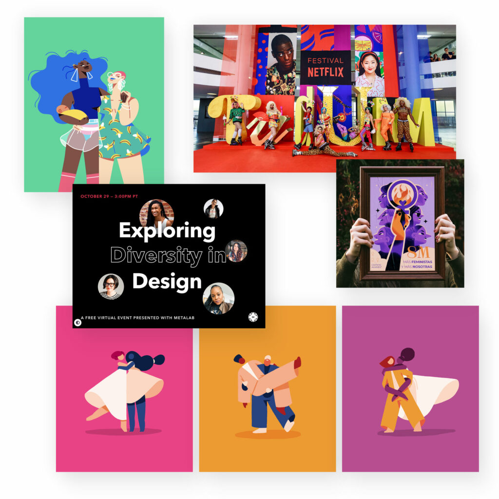
Fortunately, more and more importance and attention is being paid to the diversity of society and different lifestyles. Movements such as Black Lives Matter, LGBT*Q or feminism stand for this development.
This is also increasingly expressed in design. For example, more and more often it is not only the „cliché white person“ who is depicted, but people of different skin colours, genders, and generally different physical, sexual and psychological characteristics. Discussions are just beginning about the representation of diversity through artificial intelligence.
So it’s not so much a style or a trend, but a development that should result in the representation of a more representative cross-section of society for all of us.
Colours
Colours are probably the most powerful design tool.
In addition, there are colour gradients that disappear from time to time and make way for monochrome colour areas, only to suddenly reappear as if from nowhere. It almost doesn’t matter whether you use gradients or monochrome colour areas, somehow you’re always on trend with them…
Natural colours
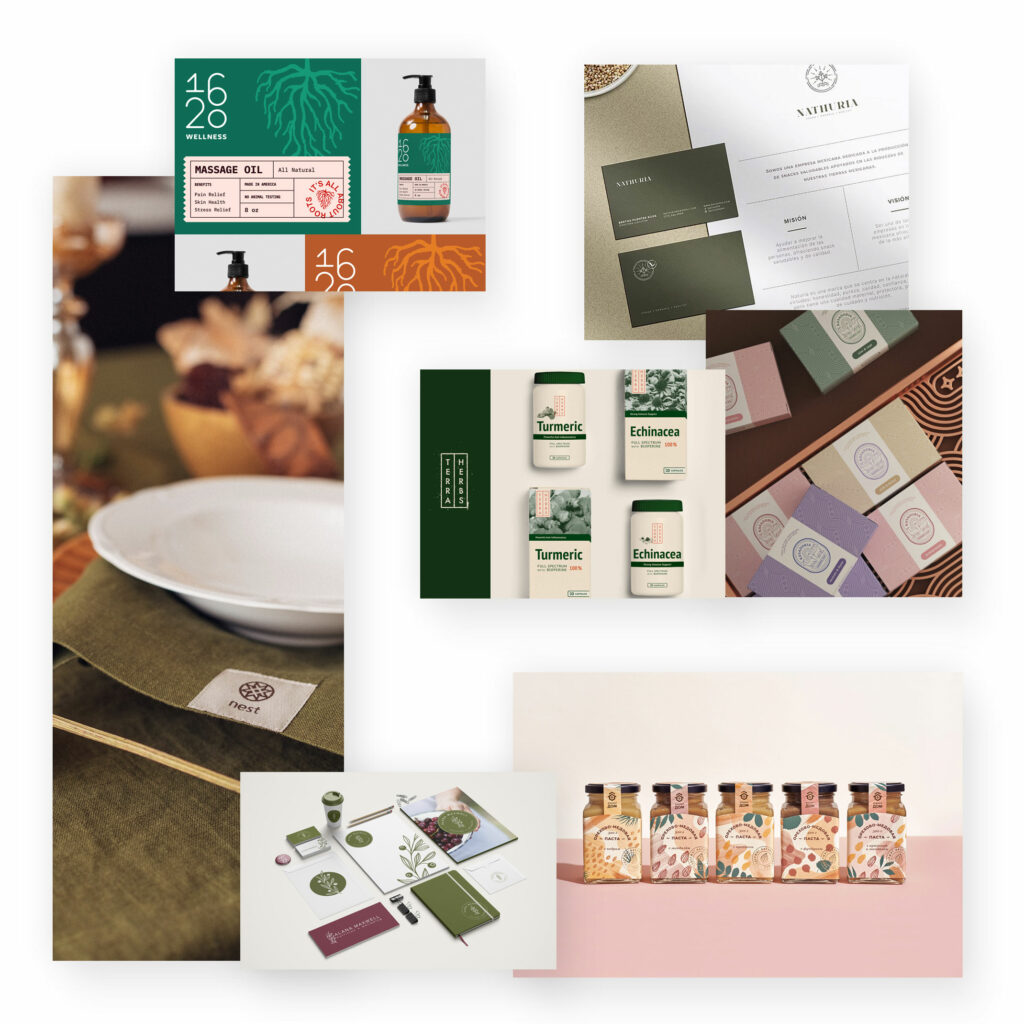
Back to earth: environmental and natural themes and effects are very much in vogue. Soft browns, beiges and whites, plus somewhat faded pinks, blues and greens create a natural effect.
Several of these colours used together create a very intense natural effect. Used individually, alongside other less natural colours, they can give a design a slightly natural effect.
Earth colours may always seem a bit old-fashioned, but it is precisely this retro effect that is often in demand again, as it conveys memories of (supposedly) good old times…
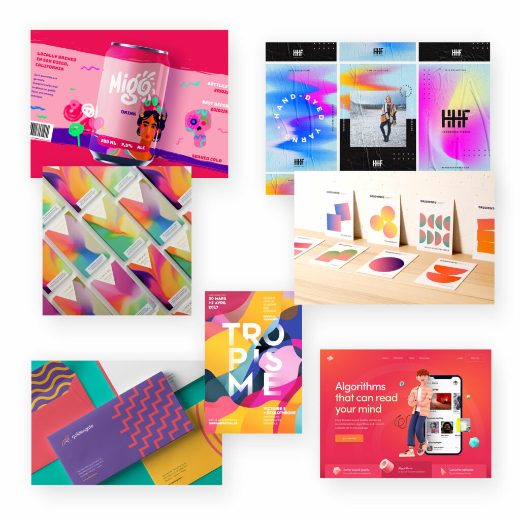
Bright colours and complex colour gradients
Colourful, attention-grabbing tones – make designs look more vibrant, bold and innovative. Whether one-sided or with gradients, modern designs like to use bright, sometimes even garish colour tones.
Colours are not just a design tool to create certain effects, to direct the eye and to emphasise special elements. Colour can also stand for itself, or be used as the sole/own design element.
In this case, striking colour combinations are often used or colour gradients that are intended to appear less harmonious than rich in contrast.
Very saturated colour tones are found in graffiti and pop art, both of which had a great influence on graphic design. They can be used to create high-contrast, vibrant and youthful designs that attract a lot of attention.
Neon colours
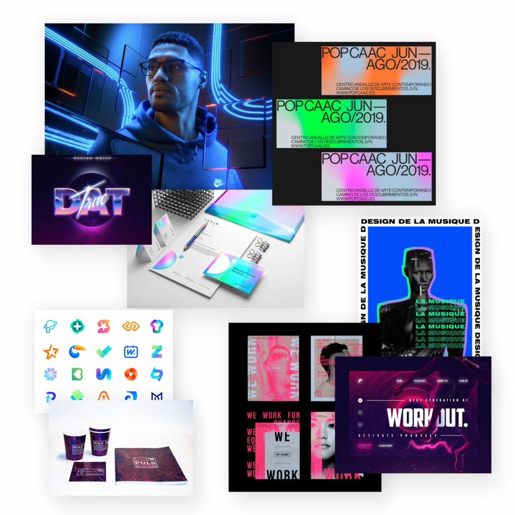
Neon advertising from the last century somehow never really went away, but survived in the „background“ and is now and then deliberately brought out. Designs with neon colours look inviting and cheeky at the same time.
A bit synthetic, and yet also individual-personal. Like the neon lettering in the window of a small shop where the owner still sells himself.
Neon colours can create a fresh, modern design on the one hand and at the same time exude a nostalgic charm.
Muted colours
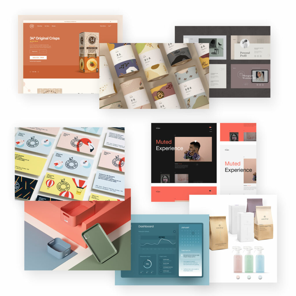
Quasi the counter-trend to bright colours: Muted colours are less luminous, more greyish and desaturated. These colour tones take a back seat and allow other design elements to come into their own more effectively.
But it is precisely the interplay of bright colour and muted colours that can be very interesting: The effect of a strong colour tone is greatly diminished if you surround it with other bright colours. They compete for attention and can quickly seem unpleasant and like „too much“ design. But combining a bright colour together with muted colours can bring out the best of the respective hues.
Watercolours
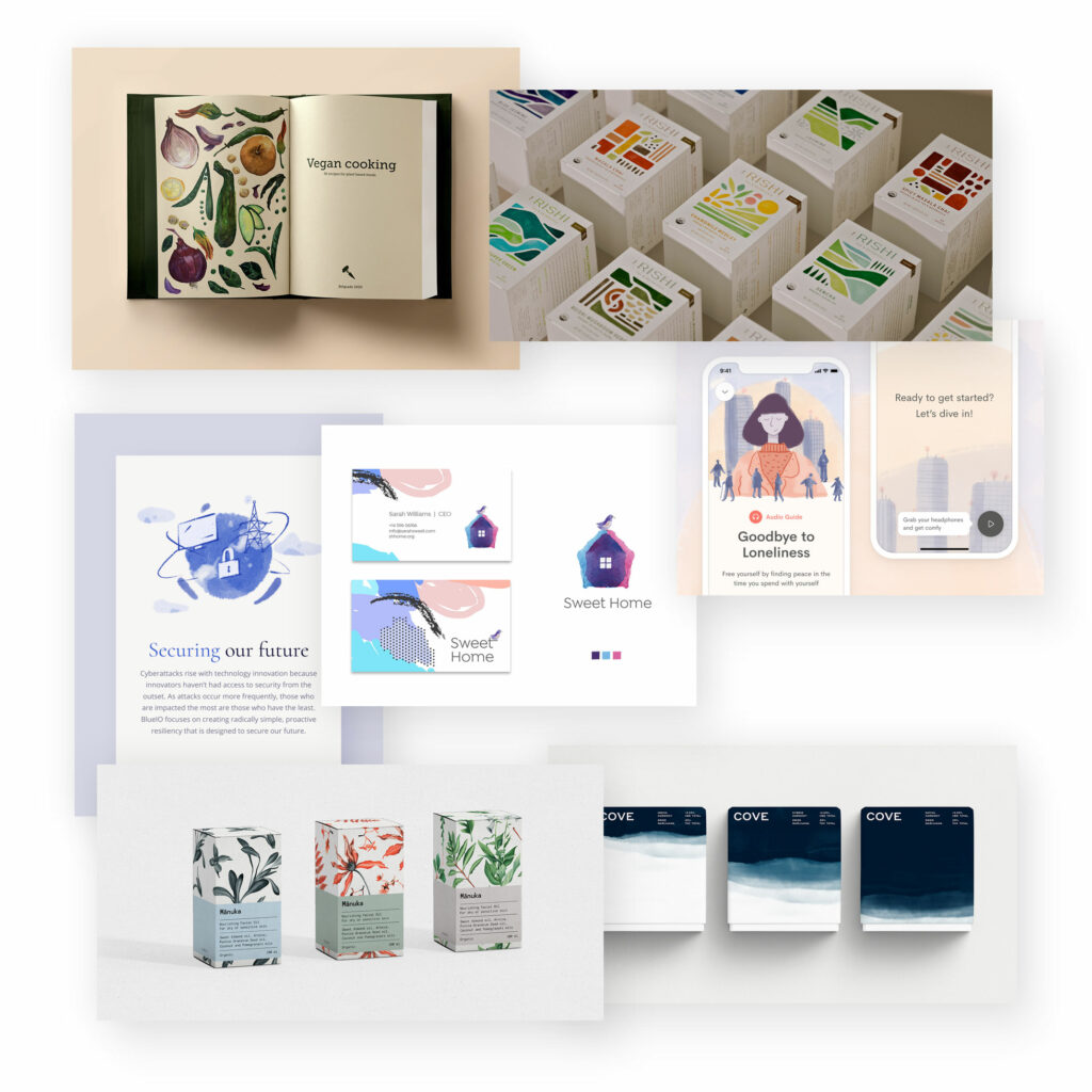
Water colours create an unmistakable look and touch of „dreamy“.
In addition, there is the personal-authentic impression and the individual implementation. It fits well with individual, personal, also handmade offers. But also to sustainable, natural products.
Pastel colours
Pastel colours are quite light, light shades that appear harmonious and restrained. They have a low colour saturation and appear soft and calming.
However, they can appear not only light but also lightweight and are therefore less suitable for very serious and „heavy“ themes.
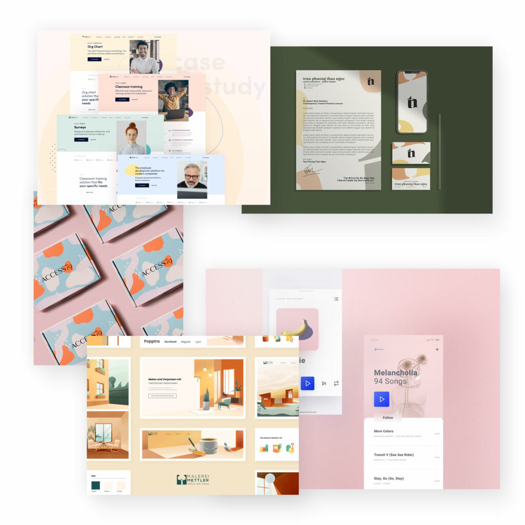
Disharmonious colour combinations
Not everything has to look harmonious. For example, a disharmonious design can attract attention, especially as a contrast.
Pastel colours with neon tones would be such a „strange“ combination. Perhaps not a feast for the eyes, but a bold, lively design suitable for innovative, modern brands.

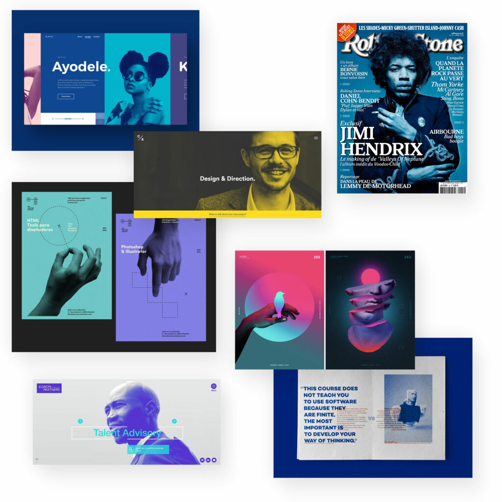
Monochrome / Duotone colours
Colouring images in a two-tone style is a great modern effect that can set accents and achieve high recognition. Especially in advertising, this stylistic device has become popular. It can also be used to create uniform picture worlds without the original picture colours playing a role.
Depending on the two original colours, these duotone effects can be very contrasty and striking or very harmonious, subtly calming.
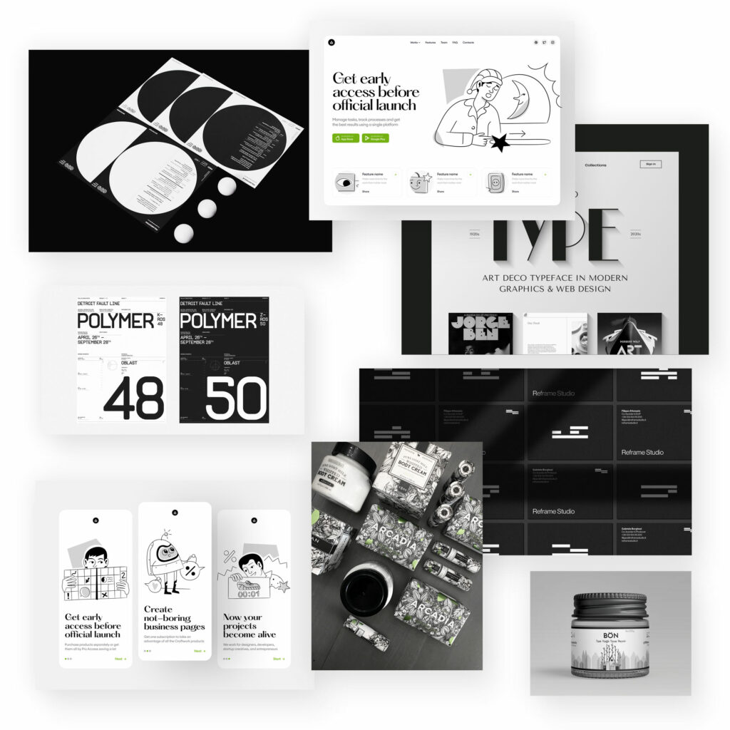
Colourless / Black and White
To stand out in this colourful, noisy (advertising) world, it can be just helpful to reduce, also in colour design. Pure black-and-white designs (or greyscales) have a contrasting effect and set counter-accents to colourful layouts.
As in black-and-white photography, omitting colours opens up new possibilities, scope for discovery and design. Shapes and proportions gain in importance. The content can become even more central when fewer design elements can distract.
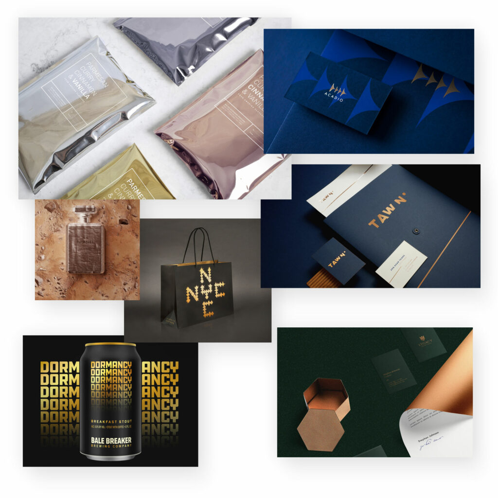
Metallic colours
Metallic colours can create a modern, high-end look. Gold in particular is of course predestined for this. However, metallic colours should then also be the focal point, or few other design elements should be used.
Metallic tones have a high-quality, noble and often even luxurious effect. Especially when implemented as a shiny surface, the effect is also very Haitian.
Gold conveys luxury and modernity
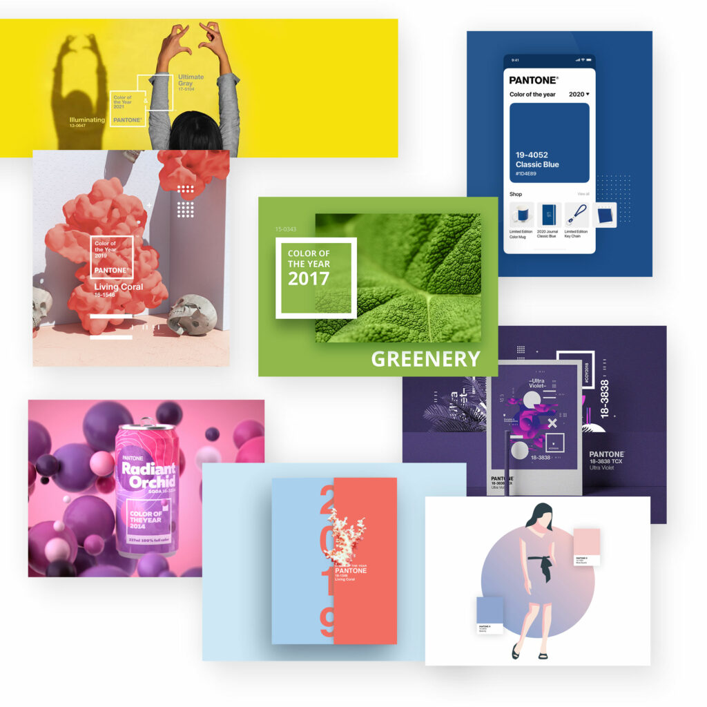
Pantone colour of the year
The well-known colour manufacturer is also a master of marketing: for more than twenty years they have chosen the Pantone Colour of the Year. More or less arbitrarily, one, and in the meantime sometimes two colours are chosen and advertised. A pure PR stunt, but one that also presents possible colour shades that (can) appear modern.
Typography
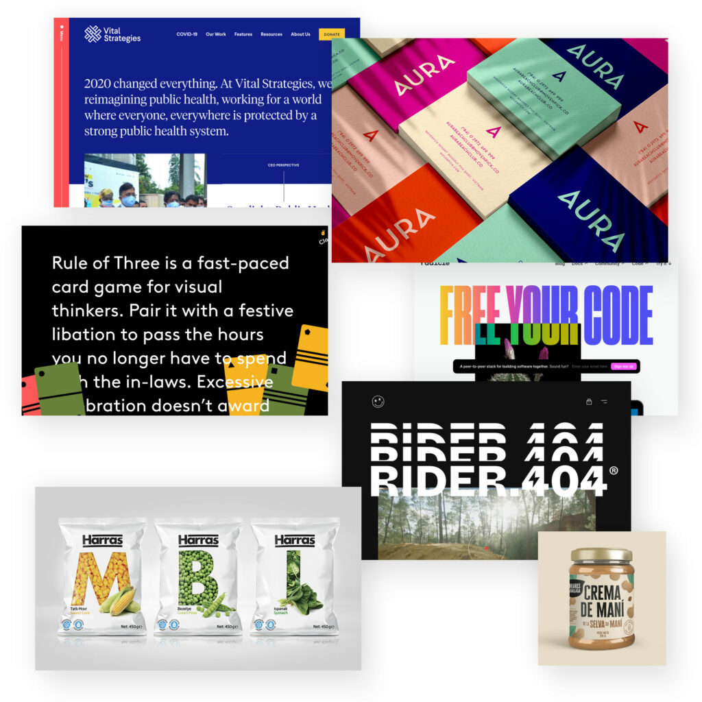
Large typography
Big, bigger, typography – (too) often the focus is on images, colours and shapes. But large letters, which express the content message in clear words, are predestined to be the striking design element. In this way, content and design become one.
In some cases, the font sizes become so large that they are almost illegible.
Typography-only
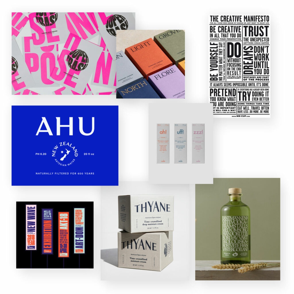
For the „big typography“ trend even further: a rather experimental approach is to choose a typography-only solution. Designing with text only – this is not possible with any other design element.
If typographic design is often given too little attention, this trend reverses this.
Large, decorative typography results in a very striking design that is rather unusual and therefore not infrequently also irritating, or at least surprising.
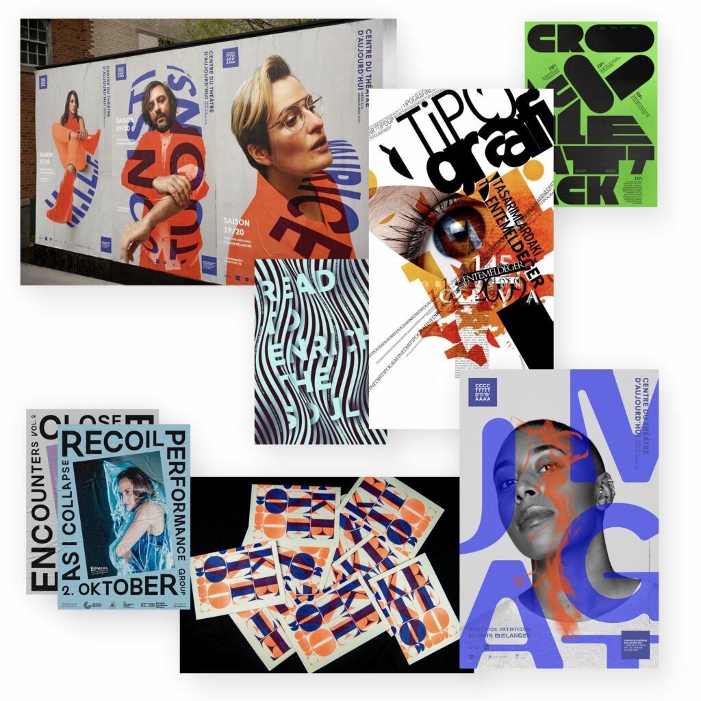
Typography „Chaos“
Takes up the previous two styles and continues them: large letters, often mixed with different fonts, or even your own letters in a very graphic way.
Or supplemented with ornaments, decorative design elements, so that a colourful typography potpourri is in store. These are more like complete works of art and less like a standard typographic design.
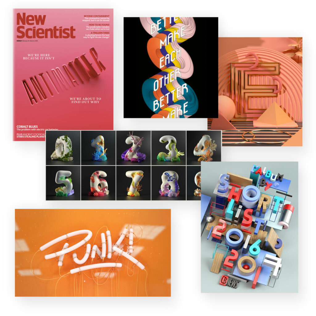
3D typography
Here, too, typography comes into its own: three-dimensional letters make a design spatial and provide an eye-catcher.
Similar to 3D illustrations, this creates a spatial depth and makes the designs look more playful and free.
Handwritten fonts
It doesn’t get much more charismatic than handwritten typography. Countless handwritten fonts are available for such an effect.
Sometimes striking, sometimes curved harmonious, sometimes elegant, sometimes scribbled – in any case always with a personal touch.
Talking about handwritten fonts: Calligraphy is the embellished version, so to speak. With them, a design not only looks more personal, but also more elegant and harmonious.
Handwritten fonts create a personal and authentic style:
In advertising, logos and websites.
Lettering
Handlettering is a mixture of handwritten fonts and calligraphy. Texts and letters are specially „drawn“ and embellished so that they take on a decorative character.
This style of typography also conveys a very personal and special touch, but also appears quite playful.

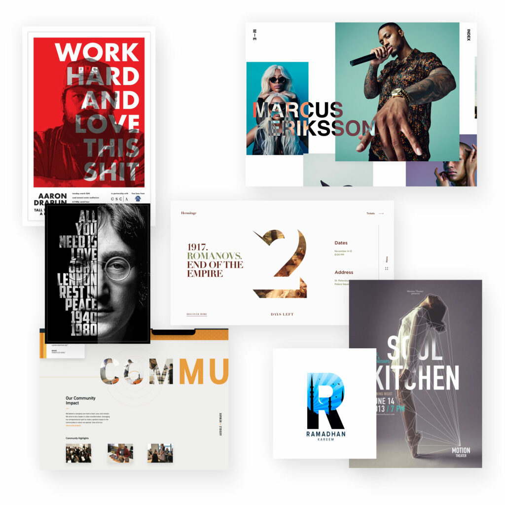
Image text mask
This is another way to give different image motifs a very unique and uniform look. This composition of image and text only works with very large typography and rather with clear, bold letters.
The focus here is less on readability or the image motif and more on the graphic effect.
Illustrations
Digital tools have also given illustrations a multitude of new possibilities for expression. Since many classic photo motifs are already chosen and often drift into cliché or standard images, it is precisely here that illustrative designs can be innovative and modern and create an individual effect.
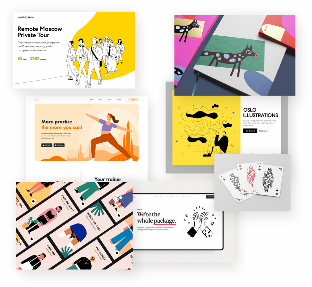
Simplified illustrations
Especially illustrations that are rather simple and not overloaded are often used to give designs an individuality and personality. The scope of styles and features is nevertheless huge.
Sketches
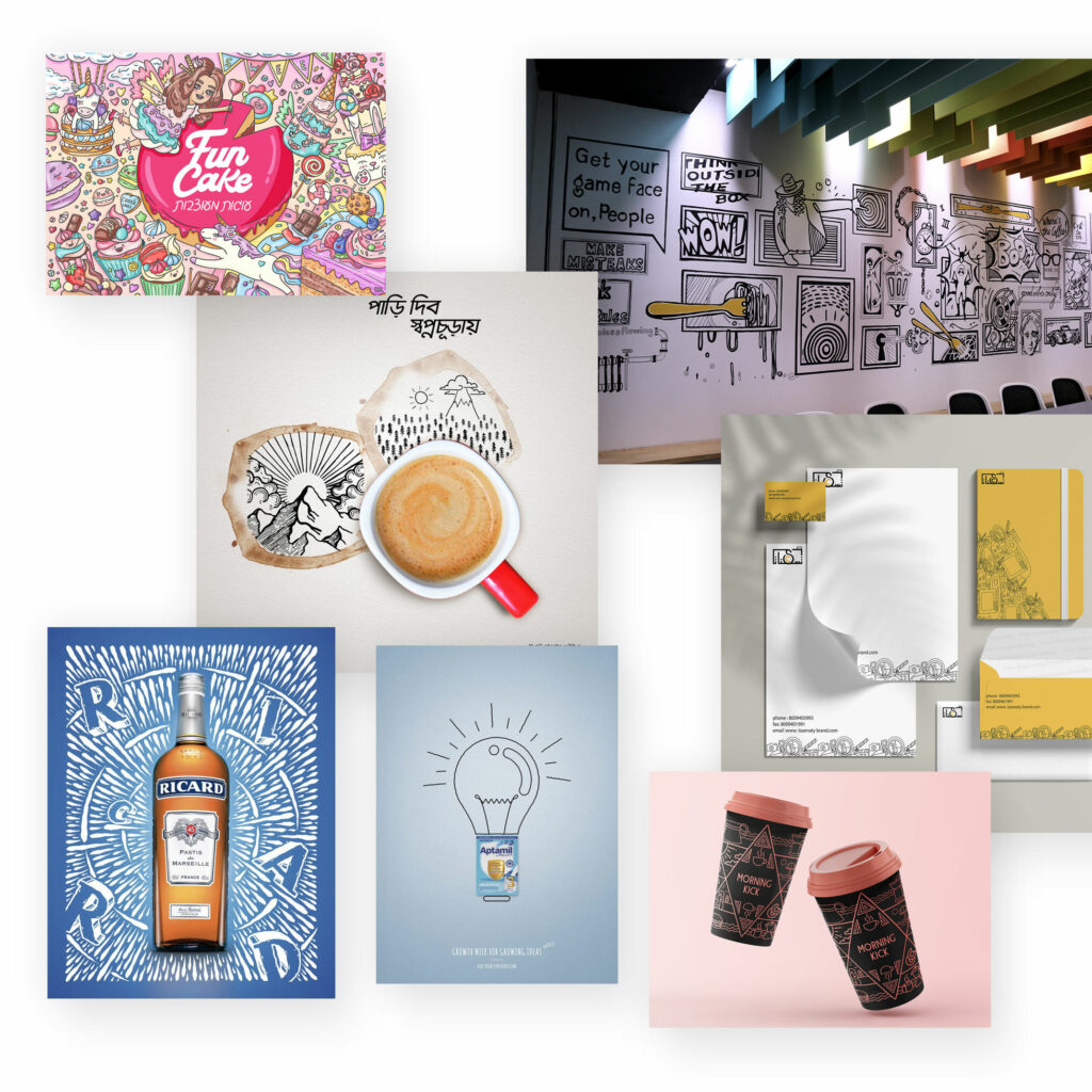
Hand-drawn illustrations, sometimes called doodle art, look like they were drawn with pencils. This gives them a very personal and unique character.
However, they can also quickly become playful and too detailed, and are therefore only suitable to a limited extent for classic companies or purposes.
Doodles in particular also have a very informal and personal effect, almost as if they were sketched on the side.
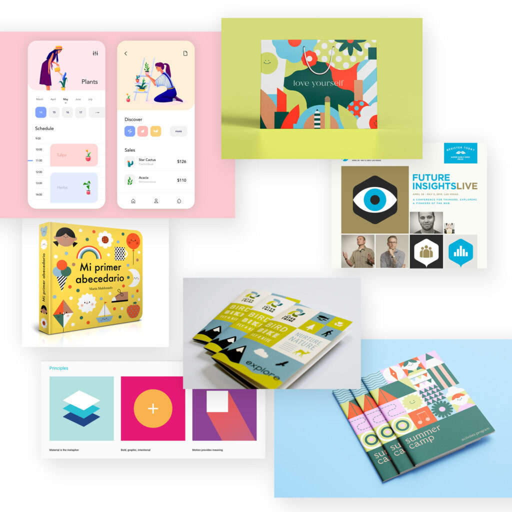
Flat illustrations
Flat design developed a few years ago in user interface / web design and is characterised by a minimalist graphic style in which mainly monochrome colour areas are used.
It is thus a clear counter-trend to overloaded trends and too many graphic elements.
The Flat Illustration trend is particularly popular in the implementation of icons.
Isometric illustrations
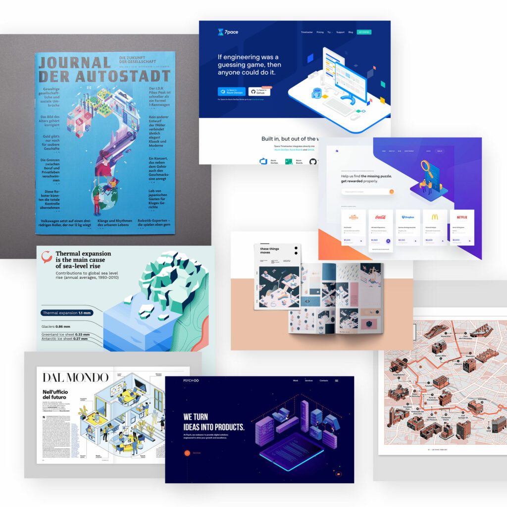
Stand in contrast to the upper flat illustrations. The flat two-dimensional illustrations become spatial 3D illustrations. These are then provided with significantly more details and appear more individual, but are therefore also more difficult to create or find suitable.
Isometric illustrations are preferably used for user interfaces and web design. They have a very clear, typical geometric structure that looks as if it came directly from an architectural design.
3D illustrations
… are not as geometrical as isometric illustrations, but much freer and more realistic-spatial.

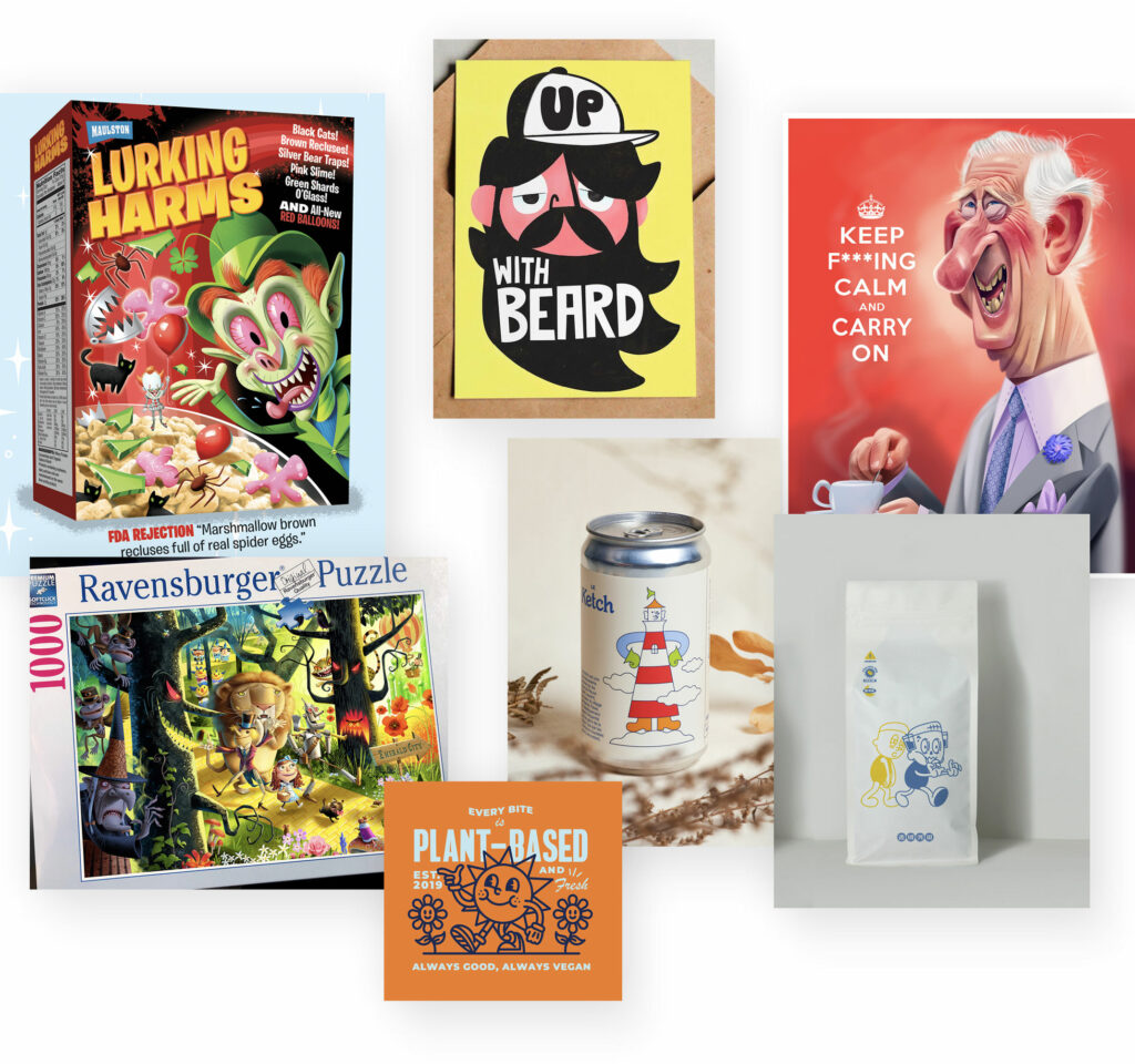
Cartoon illustrations
Although most of the illustration trends presented can be used to create individual designs, most of them will lack the unique character because you have seen these types of designs too often.
To escape the usual illustration monotony, you can also use your own illustration characters. Mostly realised in a kind of comic/cartoon/cartoon character style, this creates illustrations with a very high recognition and, above all, a unique proverbial character.
These sometimes have the effect of a mascot and are therefore particularly suitable for very playful, rather imaginative uses that are intended to have a high personal and/or community impact.
Line art/illustrations
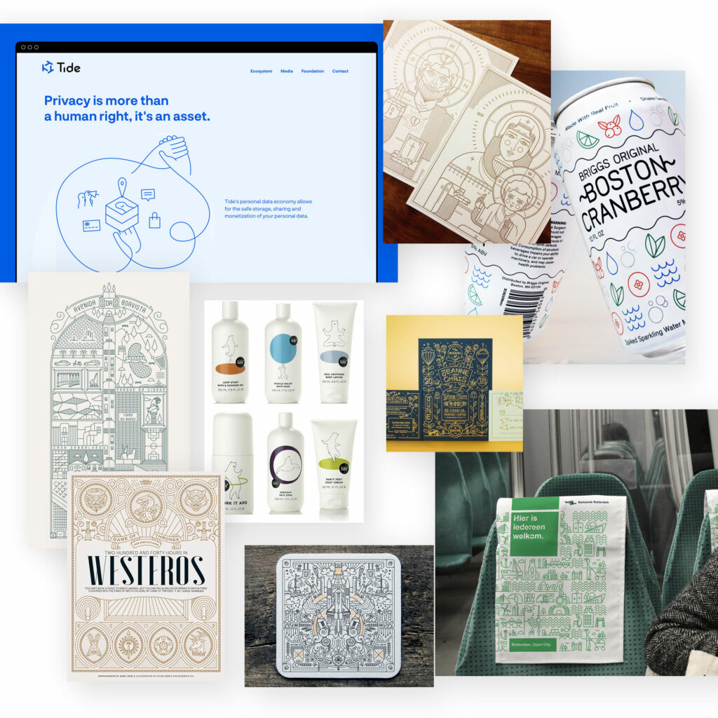
And it gets reduced(er) again: Very stylised, shadowy illustrations.
Here there are just enough elements (or even just a single line) to recognise the motif and achieve the desired effect.
As is so often the case in design, the same applies here: Less can not only be more, but is usually also more difficult to achieve. Leaving out everything „useless“ so that only the essential remains is a fine art.
Line illustrations, however, do not appear simple in the typical sense, but rather simple-elegant, clean and unobtrusive – and stand in contrast to most other illustration styles.
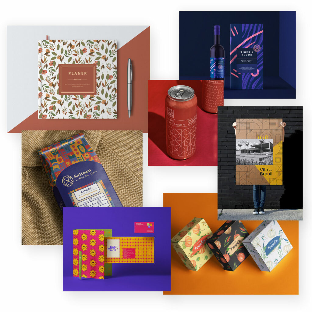
Pattern / Background pattern
Tiled background patterns act like wallpaper, giving a design its very own aesthetic.
What was popularly used in 90s web design is now also popularly used in other design disciplines. It can sometimes be reminiscent of 70s wallpaper, but it depends very much on the type of pattern.
Most of the time, background patterns create very contrasting designs.
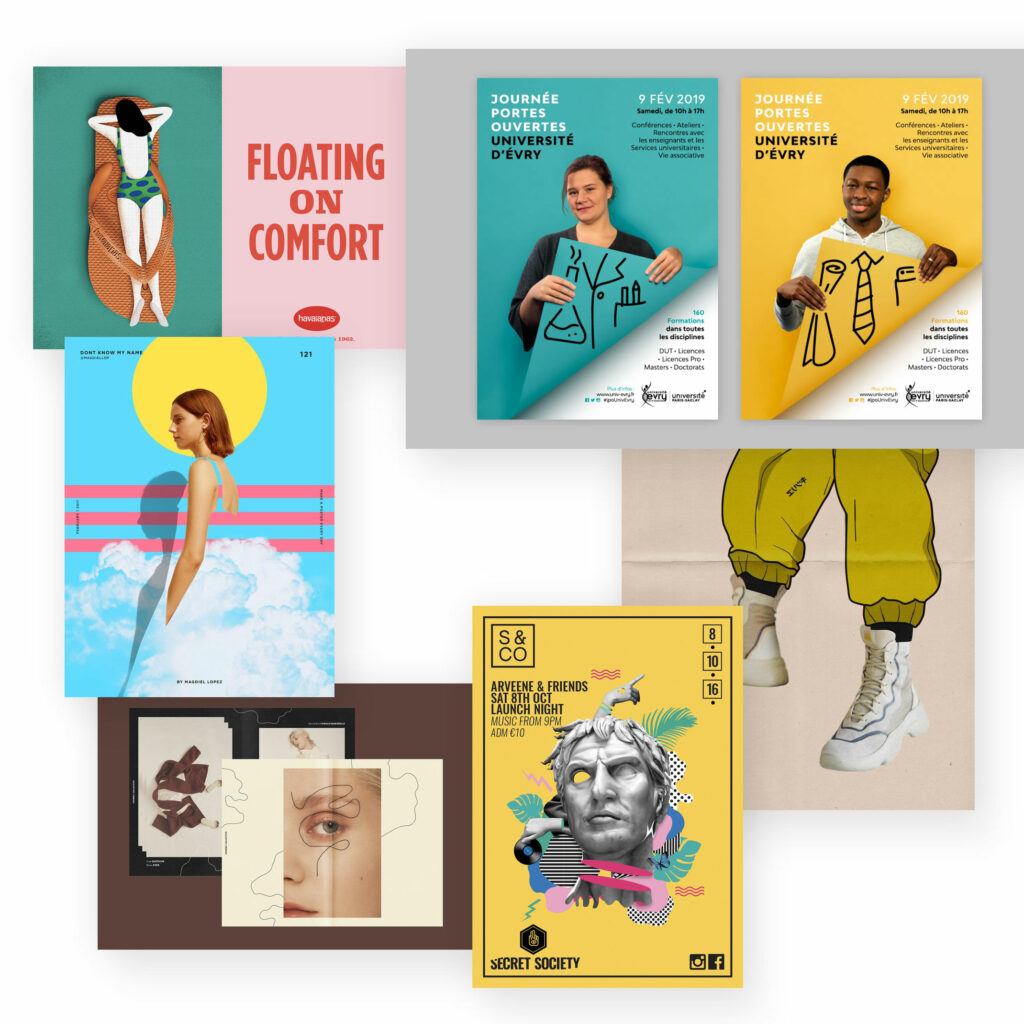
Collage of images and illustrations
This is how the best of two different worlds can be combined:
Photorealistic photos and graphic illustrations.
The result is creative motifs in which these two graphic worlds interact and can develop a very special effect. See also the Collage Design Trend.
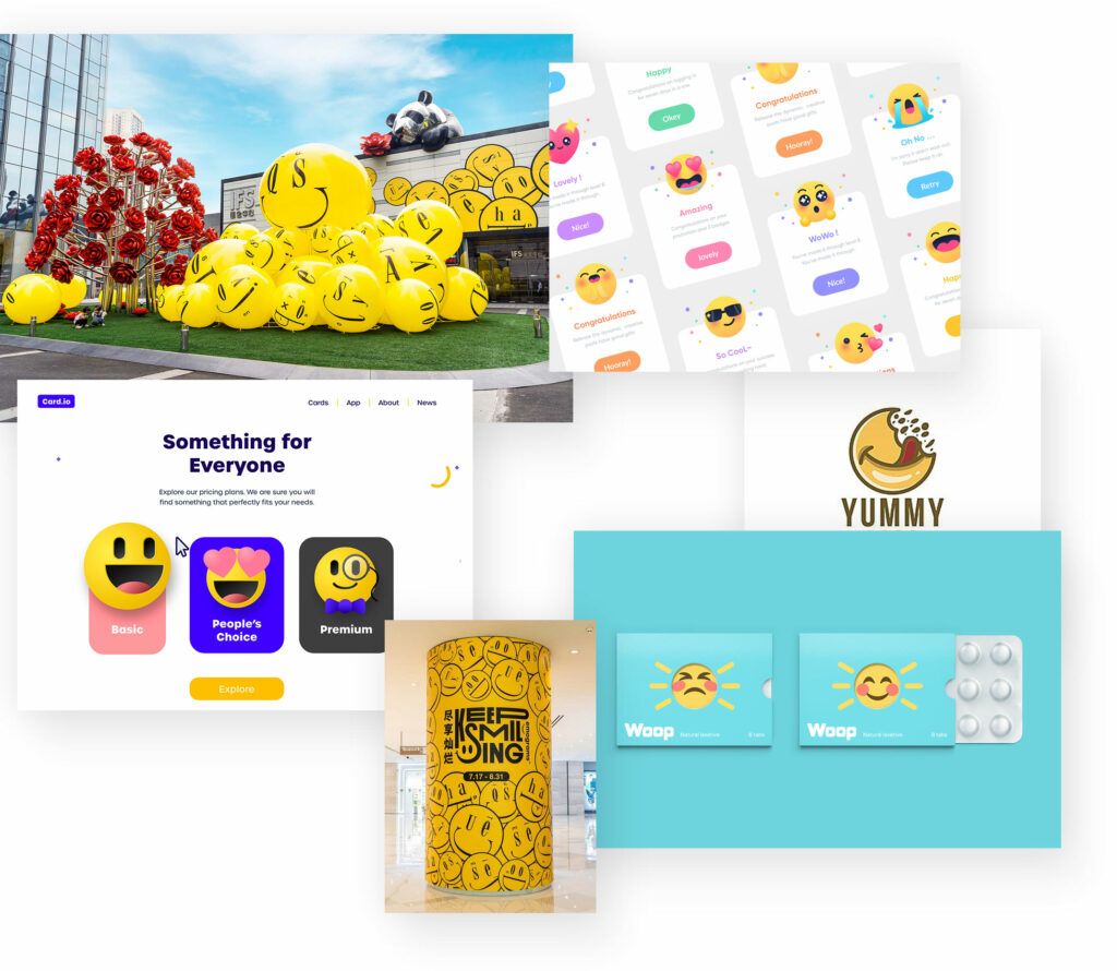
Emojis
Social networks surround us all every day. No wonder that they also influence graphic design, especially in the form of the little pictures with which we have learned to express our emotional states.
In the meantime, emojis are also found more and more frequently in design drafts. A modern cheeky face with a wink can be the effect. The little pictures are good to use in creative, imaginative designs.
Organic Design / Natural Design
Humans are – actually – deeply rooted in nature. And even if we have lost this connection to nature, we also like natural aspects such as sounds, smells or the sight of natural things.
A lot of design seems rather functional, straight and simple and the more digitalised and urbanised our everyday life becomes, the more people look to nature again. Organic design picks up on this desire with natural shapes and colours and also through a (natural) variety and „disorderliness“.
Natural design is used in many design areas such as fashion, architecture and product design. And graphic design also takes up this design trend.
Organic shapes
Shapes are – next to colours – the most striking design element. Organic shapes are round, oval or elliptical and thus appear gentle, soft and curved. They are in stark contrast to strict edges, sharp corners and straight lines.
Organic shapes therefore appear – literally by nature – more harmonious and calming.
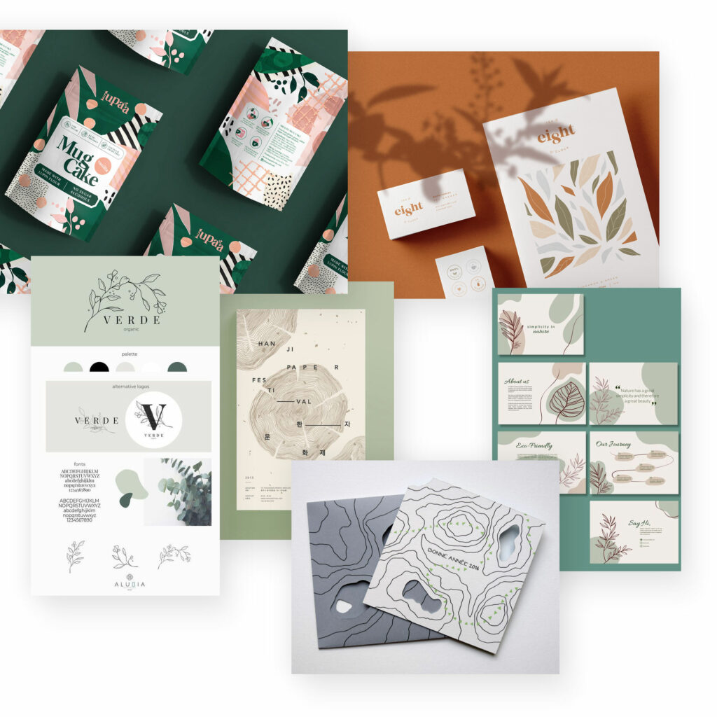
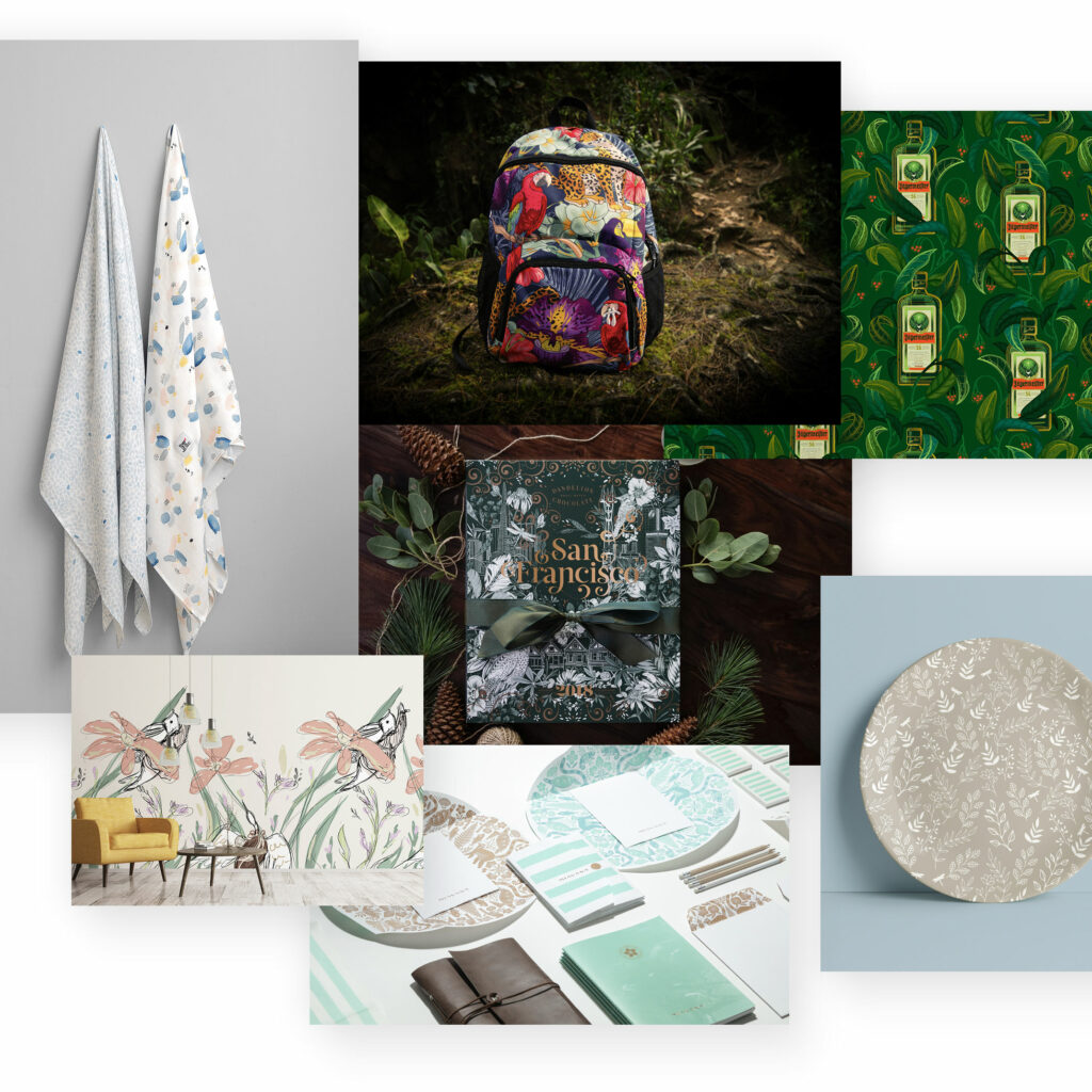
Botanical design is even more concrete than natural design. Here, a concrete representation of flora is used. Flowers, leaves are used realistically or illustratively and are thus somewhat reminiscent of still lifes from earlier centuries. Therefore, botanical design not only appears harmonious, natural, but usually also nostalgic.
Natural textures
If you don’t want a complete botanical design or country house trend, natural textures can be used to simulate something close to nature.
Wood, paper, leaf and earth textures convey a natural, sometimes handmade, authentic mood.
Natural colours
To achieve a natural effect, it is enough to use natural colours. For more on this trend, see above.
Sustainability
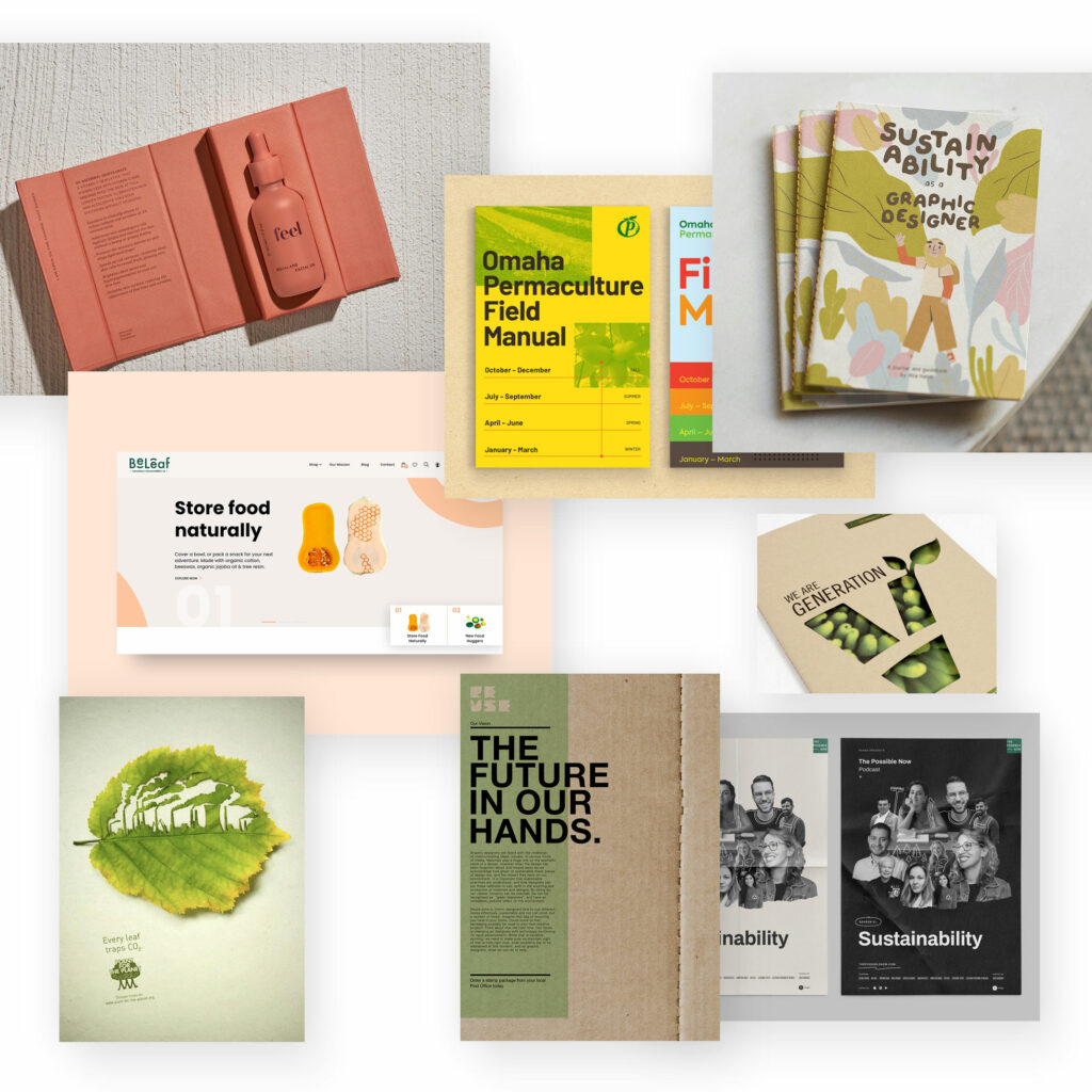
The awareness of the climate crisis and environmental destruction has finally reached the masses. Sustainable living should therefore be a matter of course for all of us (but unfortunately it is not). But also in the economy it is now becoming clearer that something has to change in the choice of materials and production. Sustainable management is slowly but surely coming to the fore.
In design, this sustainable intention is often created with a natural design, which is also often less overloaded, but also comes across as clear and simple. Added to this is a natural choice of materials.
DIY aesthetics
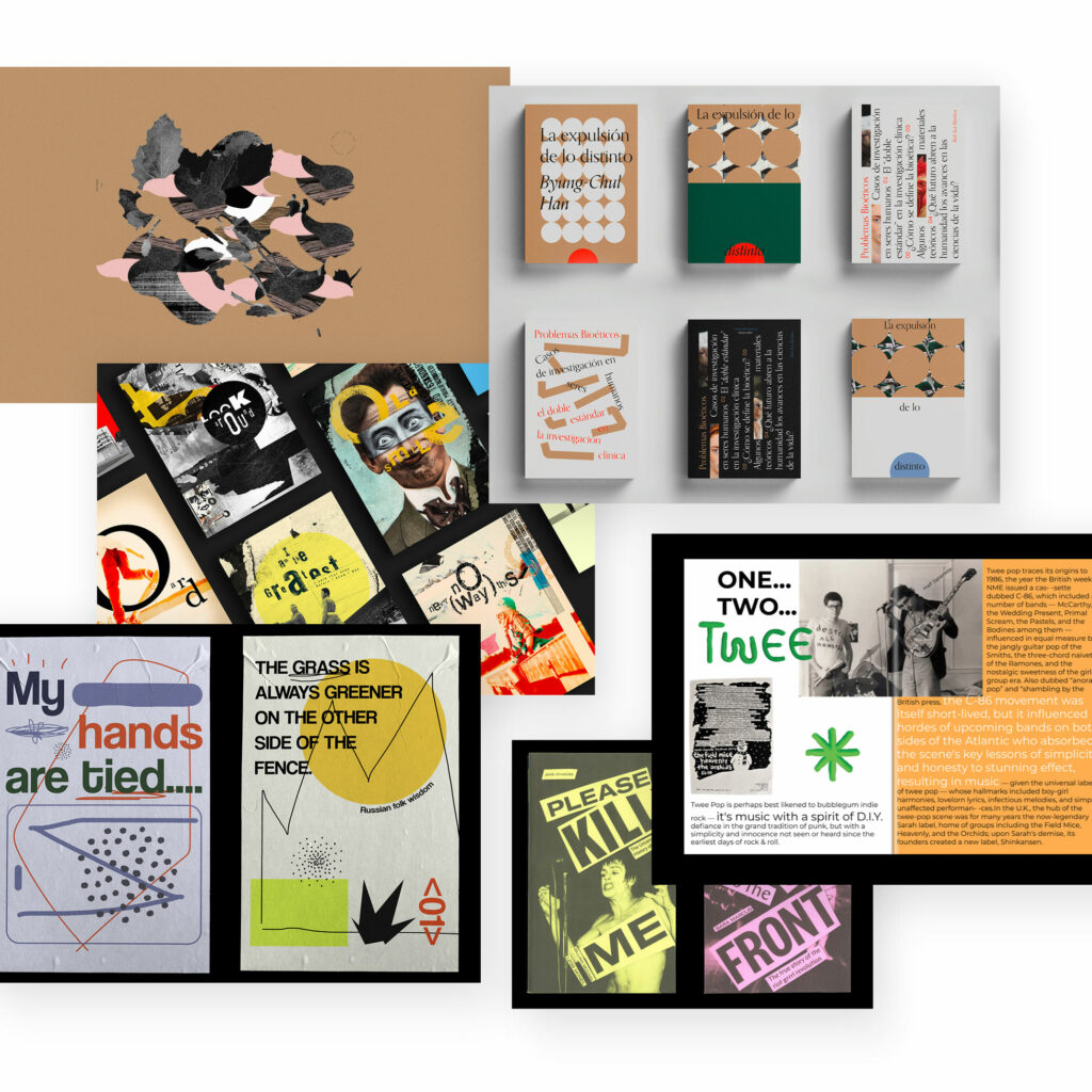
Again, it’s very clearly about creating a counter-trend to our artificial world with its standard mass-produced products: homemade, somewhat unstructured, not so clear lines, always different and somewhat imperfect. DIY design always seems a little unfinished and handmade, in order to convey a personal and individual character.
Natural materials are often mixed and put together like collages, see also the collage design trend.
If you include other design trends, the possibilities for variation are unlimited.
Epochs
Every fashion comes back. And every earlier „fad“ can also be used again well today. Because in the meantime we live in a time in which basically just about anything can be used and mixed – basically a (digital) remix culture.
In summary, the use of past fashions could be called retro design, influenced by fashion, art, pop culture, industrial and interior design. The distinctive, style-defining elements are adopted and readily brought into new contexts. Memories of old times flare up again and with them a familiar, nostalgic flair.
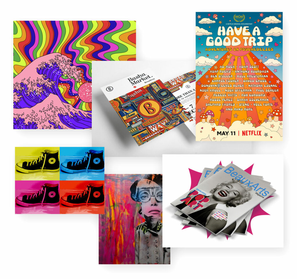
Psychedelic Design
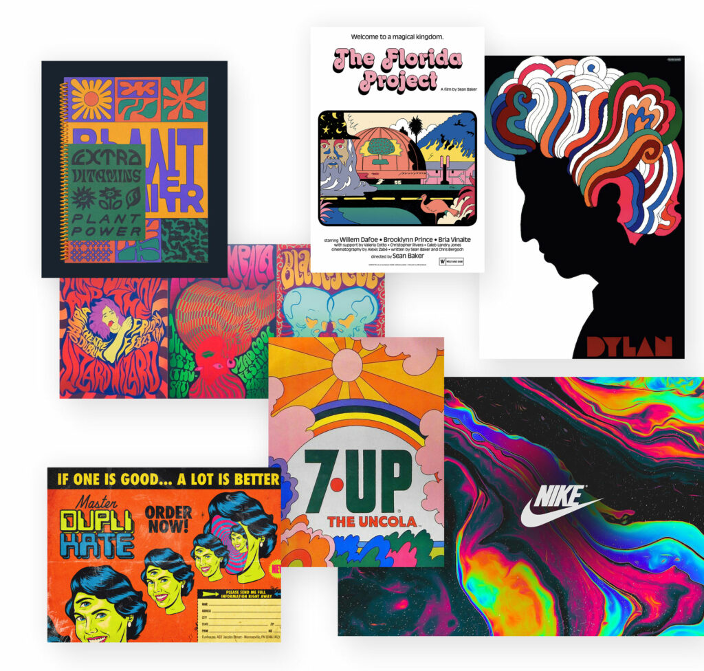
The 60s was a decade influenced by hippies, drug-inspired psychedelic experiences, bright colours and flowing patterns.
They thus entered as a contrast to the pin-up style of the 50s with its earthy colours (which could also be presented in more detail as a style).
Psychedelic design is characterised by flowing shapes, hand-drawn typography, bright colours and dream-like scenes.
Pop Art
Pop art is an ironic and lively exaggeration of pop culture from that time. Trivial motifs taken from everyday media such as advertising and realised in brightly shining colours, large areas of colour and an illustrative style.
A design style that is still popular today when it comes to a playful-modern effect that doesn’t take itself too seriously.
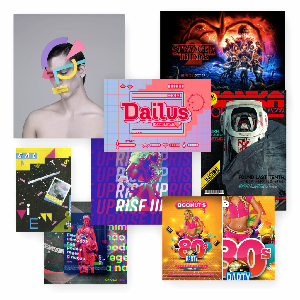
80s Pop Culture
Films, music, computer games and television had a huge influence on 80s design that is hard to imagine today. But it is only in recent years that the 80s have returned as a retro trend.
The design elements range from bold coloured areas to colourful colour gradients. From sci-fi fonts to neon lettering.
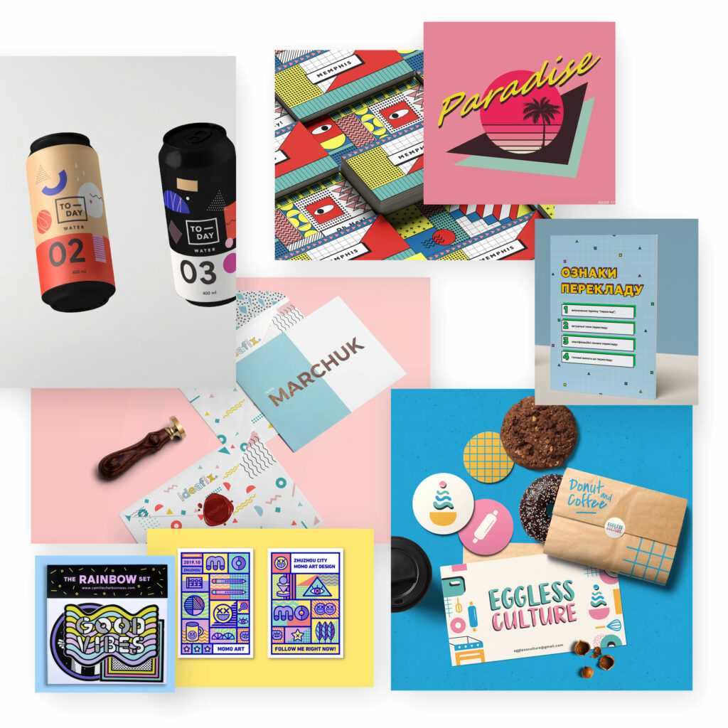
Memphis Design
Flashy colours and geometric shapes – that’s how you could briefly sum up the Memphis style. It looks a bit motley, like a mixture of Art Deco, Tropical and Pop Art.
Sometimes palm trees, flowers or other tropical elements are added, sometimes it’s pastel colours and sometimes abstract patterns – the variety is great, as is the recognition.
The result is a fresh, creative and lively atmosphere.
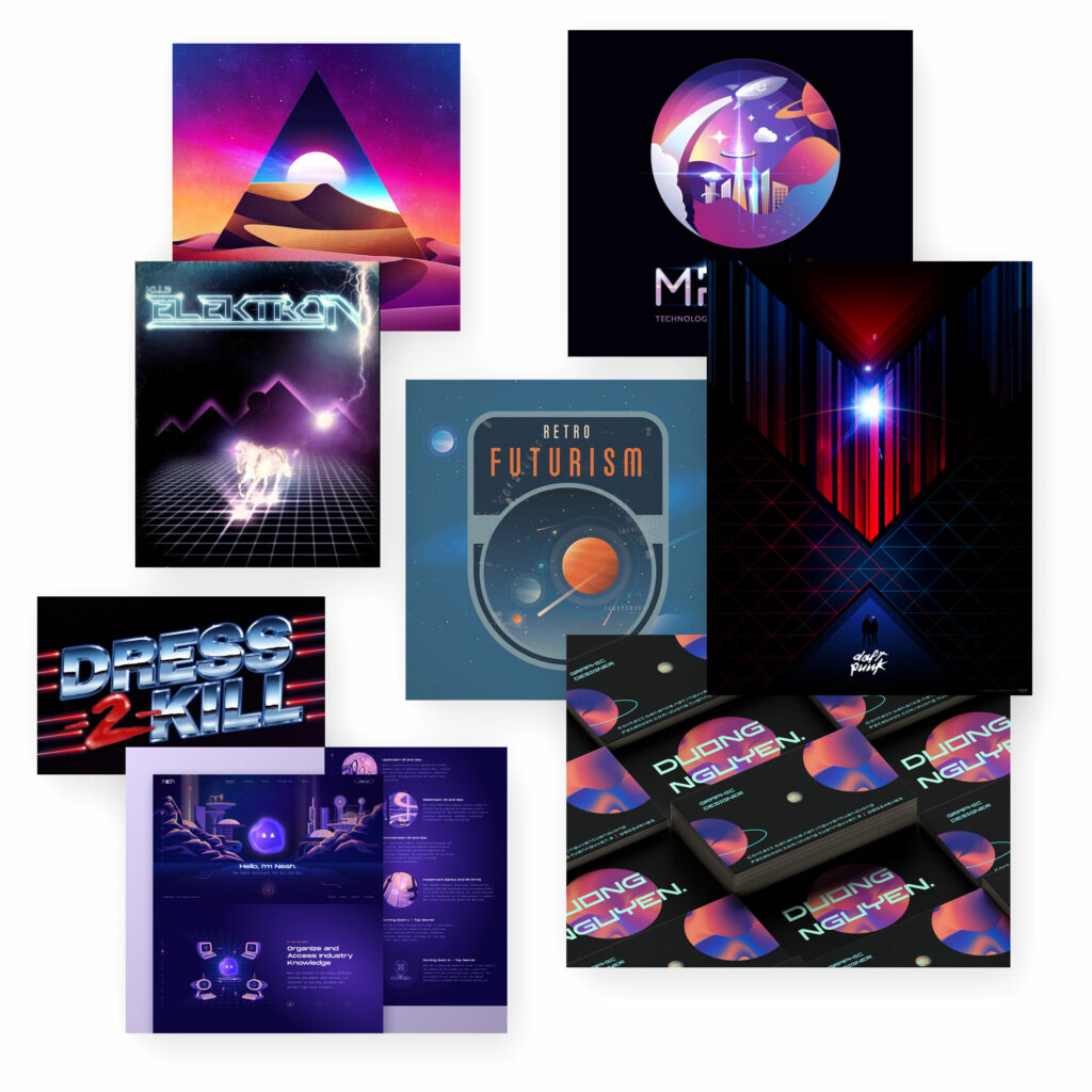
Futurism
The (possible) aesthetics of the future have always been a popular stylistic device in design – from science fiction to CyberPunk to retro-futurism. Technological progress embedded in an optimistic view of the unknown future – this is how futurism could be described.
Visually, this is reflected in geometric shapes, 3D forms, floating objects, bright colours, metallic effects and sometimes surrealistic scenes or optical illusions.
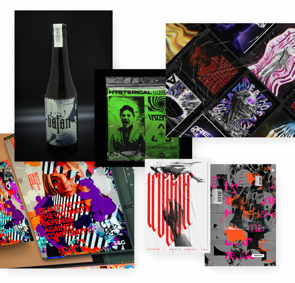
Grunge
Coming from the punk, graffiti and skateboard scene, the grunge trend reached its peak in the early 90s. Inspired by underground rock culture, it’s all about breaking the rules.
In design, this express(ed) itself in grungy backgrounds and textures, torn edges, hand-drawn doodles mixed with realistic images from real life.
The grunge style was used diligently on record covers, posters and magazines and is nowadays also often brought out again and mixed with new styles.
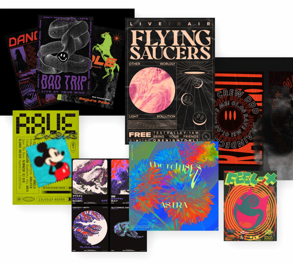
90ies Rave & Acid
Acid House – two words are enough to immediately have the typical sounds in your ears…
Starting in the 80s, this developed into the rave culture that was style-defining for the 90s.
Visually, the style expressed itself in bold typography, experimental and psychedelic patterns and neon colours, sometimes with elements of sci-fi futurism.
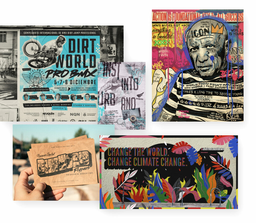
Street Art
Street art design has elements of the 70s punk, 80s acid house and 90s hip-hop grunge scenes. Rebellious and creatively stylish.
Public space is appropriated, which is often expressed in graffiti and a certain guerrilla art that often addresses political and social issues.
New Hippies
Hippie – there are floral patterns, Love & Peace, psychedelic music just some of the many associations of the movement from the 60s and 70s. In design and partly in esoteric movements, New Hippie brings this movement back to life – at least in parts, in design: 70s patterns, richer colors, unconventional typography.
New Hippie design is suitable even for New York hotels.
#
Y2K
There was a time when you could hardly wait for the turn of the millennium and it was a huge event. Sounds rather retro from today’s perspective 😉 Y2K is the abbreviation for the year two thousand (Y = Year and K = thousand).
The turn of the year into the new millennium was celebrated and feared (because of feared worldwide computer problems with the change from the year „99“ to „00“, which did not happen). Visually, it was the time of glitter elements, enthusiasm for technology, bright colors and loud designs.
Th
Graphic Design Trends & Styles
Wow, what an overview, what a collection of inspirations. It is noticeable that virtually every graphic design style can be used nowadays. There are hardly any trends left that shape entire years to such an extent that pop culture, graphic design, fashion etc. are influenced. Rather, there is a colourful potpourri of styles that are sometimes used more intensively and sometimes less. And maybe you are so creative and mix different styles all over again….
And it is noticeable that there is a counter-movement to virtually every style and trend.
Minimalism vs. maximalism. Natural forms vs. abstract geometric forms. Neon colours vs. pastel colours. Large typography vs. emojis.
So it depends more on the concrete product, the concrete brand, the intention, the target group etc. to consider which graphic design style can be used.
What do you think?
Do you use graphic design styles specifically? Is there a style or trend missing from the list that really needs to be included?
