Beliveo is a young outsourcing company that provides tele services to all kinds of enterprises. This sort of business rarely stands out.
The competition is tight and there is a lack of added value that makes it hard for the brand to arouse any emotions. However, we used this to our advantage, since it made it easier to create a differentiator for the new brand.
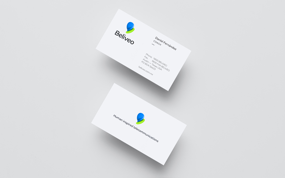
The logotype is a three-dimensional abstract icon. The goal was to give the icon a tactile quality that would make it feel warm and friendly. The „sketching“ process for said icon involved the making of sculptures and taking their picture in order to have a vivid reference.
The brand’s colors reflect joy and serenity and are paired up with a ver neatly arranged typography that gives it a professional and tech-saavy look.


