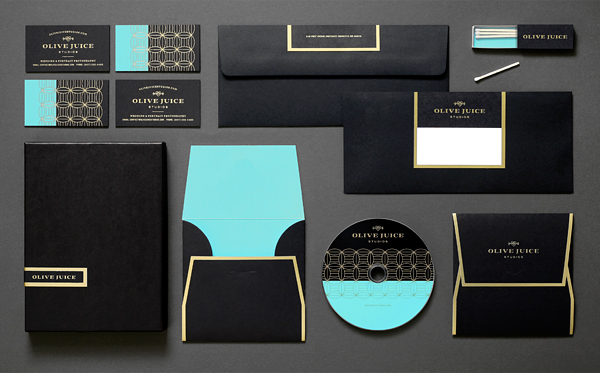
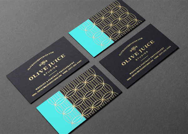
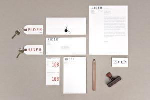
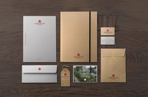
Olive Juice Studios wanted their next identity to feel sophisticated, yet have personality. This clean and classic look was inspired by their love of the vintage lounge—using gold foil and a single line-weight pattern that overlays a modern pop of teal.
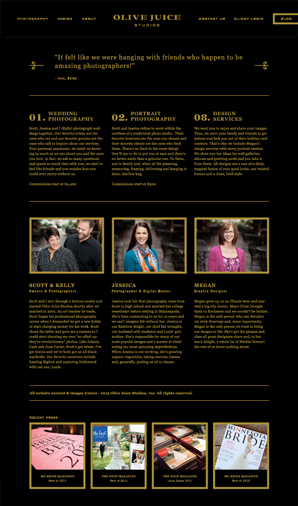
For the website, the solution comprises a simple interface and well organized information, combined with large scale photography that adjusts with the user’s browser.
Putting our spin on traditional wedding photography brands, it’s something bold, something new, something borrowed, something blue.

