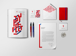
The brief was establishing an identity for two agencies, the Development agency and its subdivision Regional Centre for Creative Economy. The task was to establish that relationship in the identity.
Identities must work as one and also each on its own.
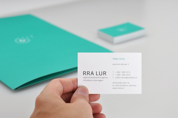
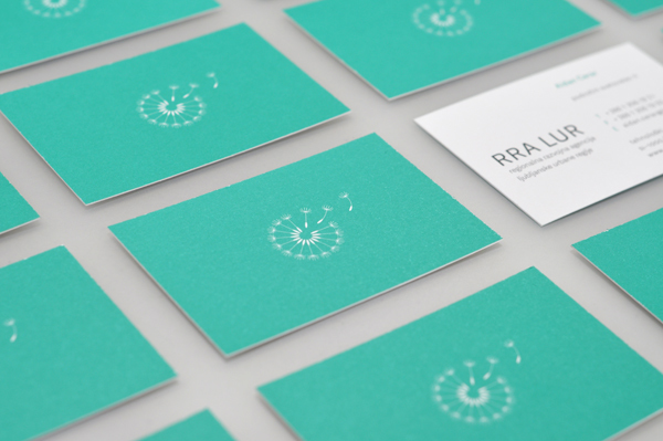
The Agency is helping companies and individuals in the region to develop their own business. The logo has to reflect their work and has to reflect the region. We decided to use the dandelion flower, because it is representative of the region and it works as a symbol for new growth. The seeds fly away and become new plants, just as the Agency helps businesses to start on their own.
Regional Creative Economy centre is currently a subdivision within the Development Agency. They help businesses in the creative field, organizing events and various workshops. The identity is closely connected to Development Agency.
As mentioned, the identities of Development Agency and Creative Economy Centre must work individualy and also as a whole but still establishing the relationship between them. We introduced an additonal element, another dandelion seed, to show the path of the seed in the wind.
See it on behance

