Tom Mark Henry is a multi-award winning, internationally recognised, Sydney-based interior design studio. Working across residential, commercial, retail, hospitality and workplace projects, Tom Mark Henry create unique, engaging and functional environments.
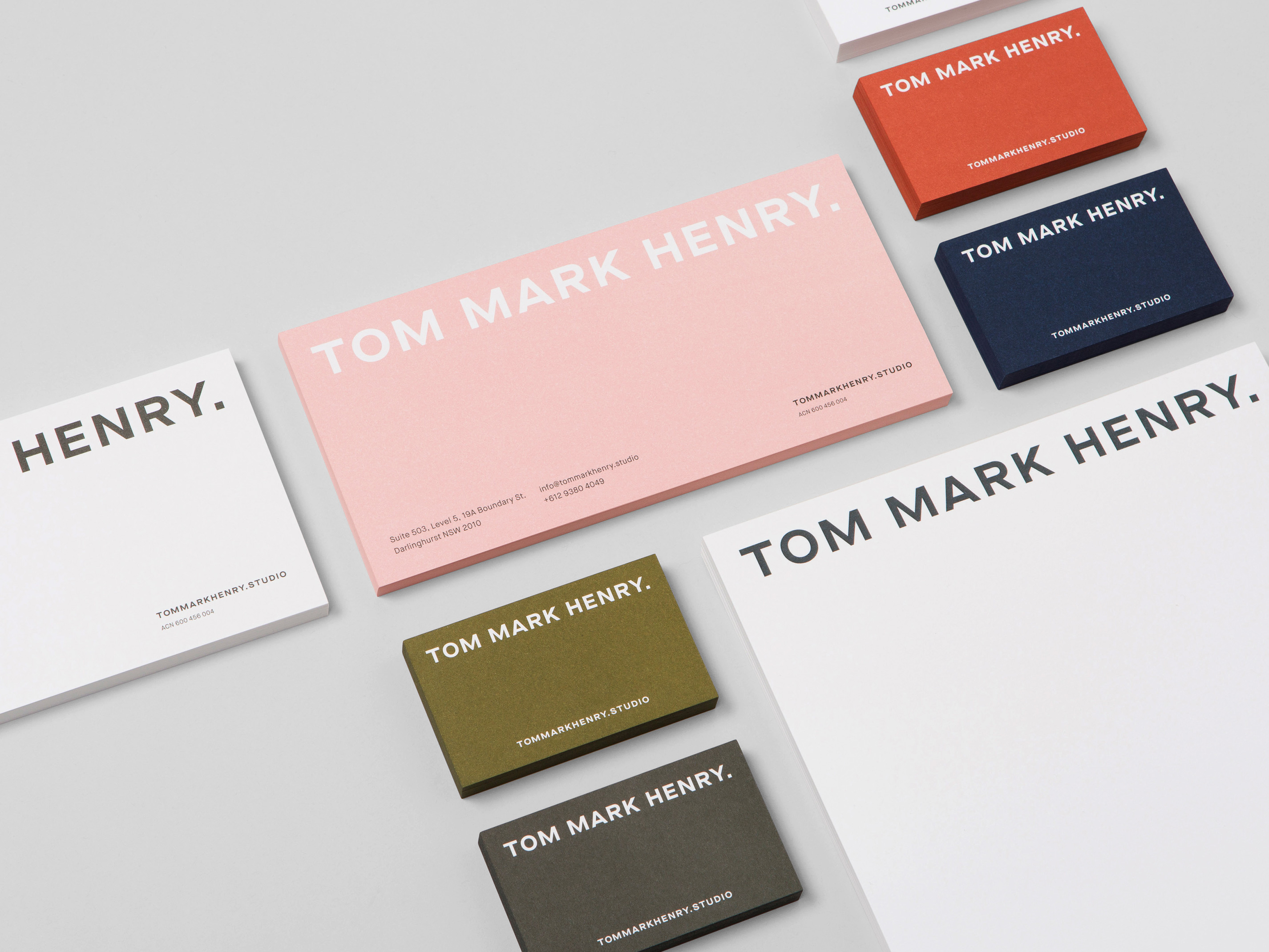
We were engaged by the team to redesign their identity to better reflect the high calibre work they produce and the services they offer. The new identity focuses on a typography system that not only complements the large collection of project imagery but also defines a suite of internal documents and acts as the foundation for an entirely new visual system.
A bold, extended logotype establishes a grid which underpins every touchpoint of the brand with a type system that features a bold and elegant selection of grotesk and serif typefaces. Complementing this system is an earthy, muted colour palette that is used throughout print and digital applications. The updated system was applied to stationery, documentation, promotional material and a custom designed and built website.


