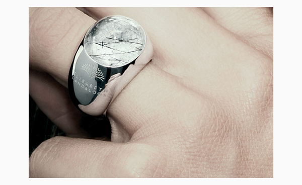
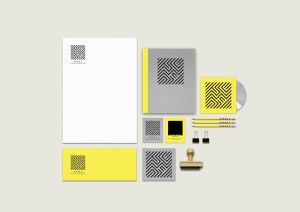
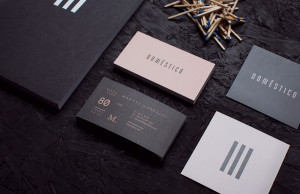
Elisabeth Landeloos Jewellery branding project is a collaboration of Alexandra Mendes with Creneau Int.
The branding concept was made upon a market research in Benelux, in order to create an identity that would translate Elisabeth Landeloos‘ character and place the brand in the appropriate business segment.
Her pieces show a wondering nature that’s reflected into the collections. Her name Landeloos means ‚landless‘, which made us look for an ideal of something vague, unfinished. Like a character wondering through no man’s land looking for pieces that would enchant her. A minimal, elegant aesthetic would guide us on that path, adding consistency to the brand.
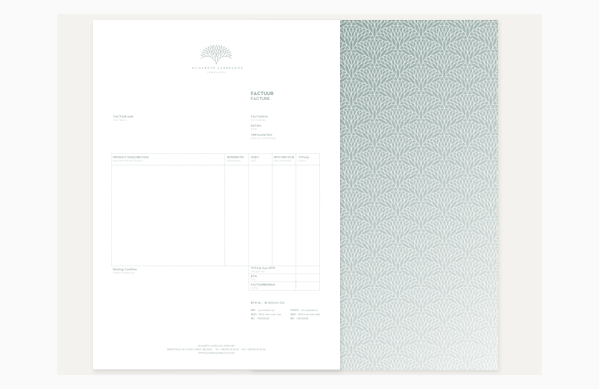
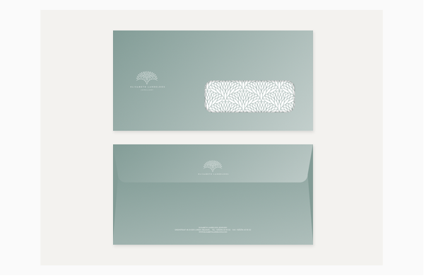
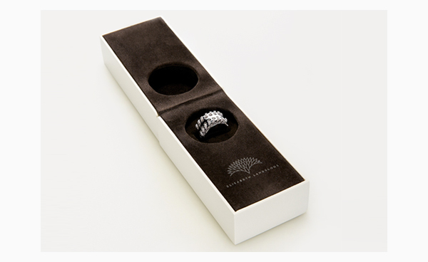
The logo design is a mutable shape where you can recognize a diamond, a flower, a tree. The color choice for the housestyle has a translucent quality, an iridescence effect when printed. The brand packaging boxes are sharp and clean, almost like a hard rock shaped into an ethereal concealing shell. They’re designed by Alexandra Mendes and further developed and produced by Creneau Int.


