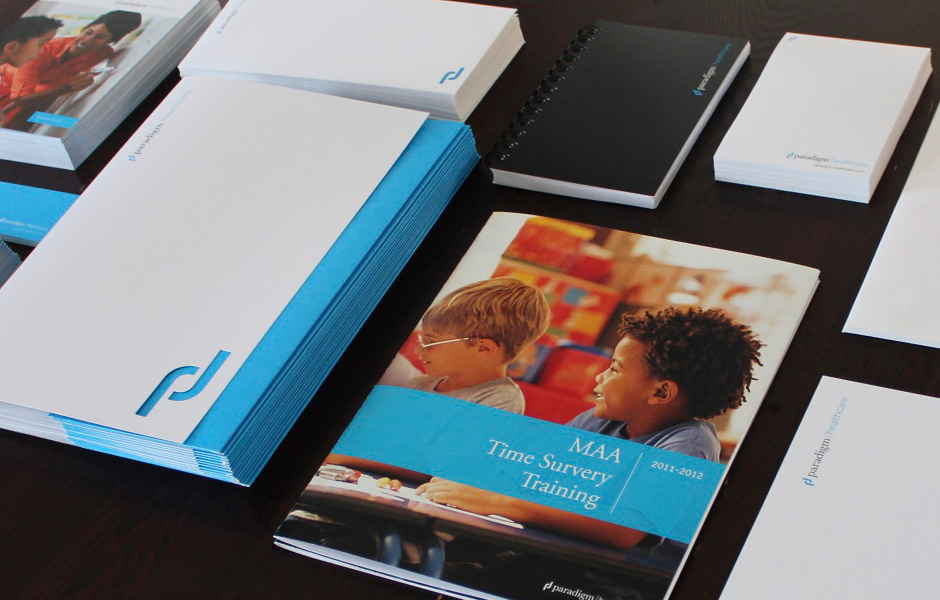
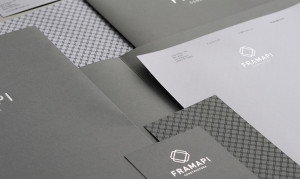
Using a traditional typeface paired with a thin modern typeface we were able to merge the tradition and expertise with the progressive nature of the company. The brand was brought to life through a family of colors, typographic rules and division logos. Chris Linden


