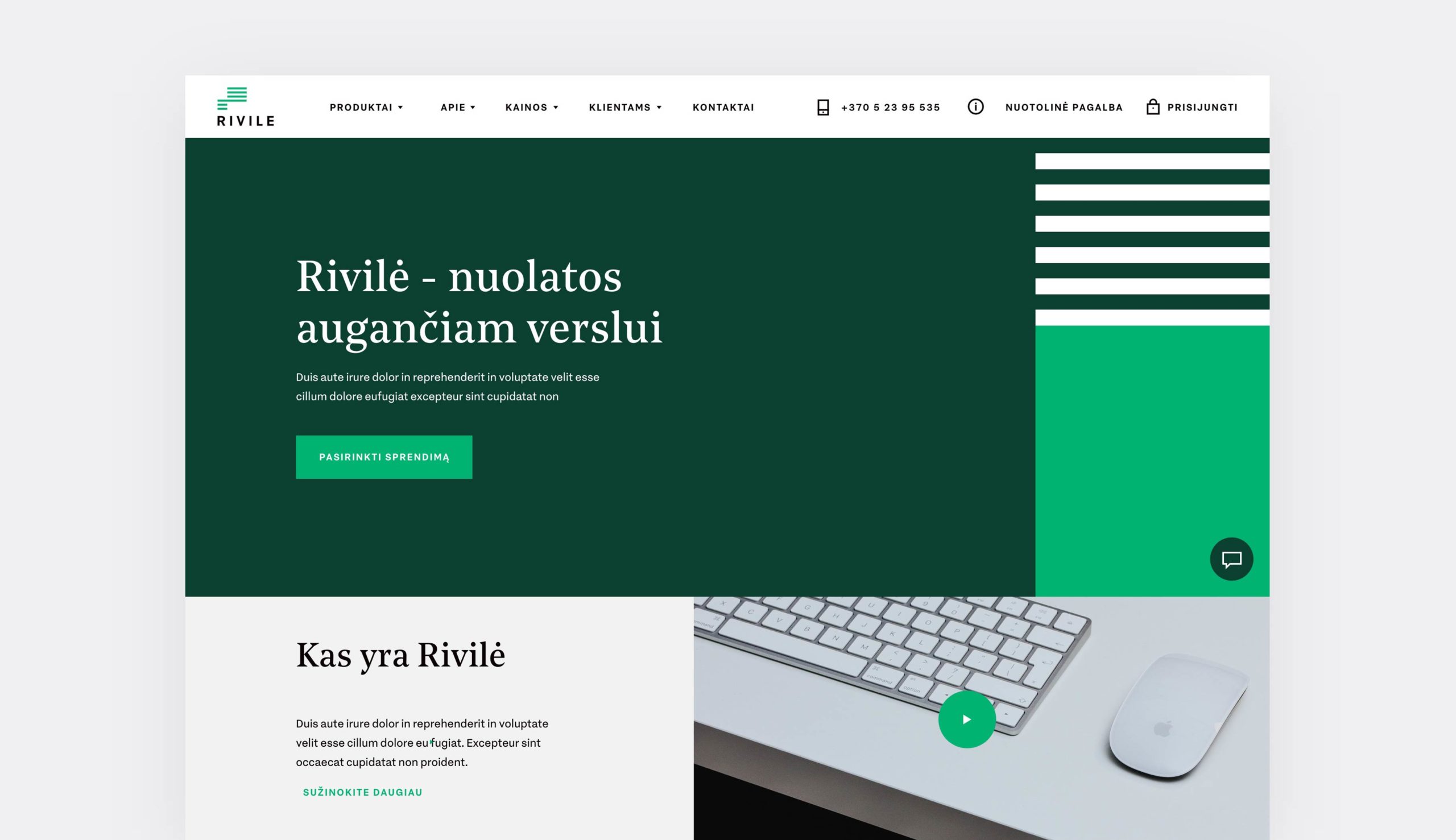
„A business that grows consistently” has become a key starting point for branding in this project. In the symbol, a line joining two rectangular shapes symbolizes the harmonious growth of a small business into a large one. Colours, a rigid grid of elements emphasize solidarity, experience, professionalism and reliability. This project is extremely complex. A complete line of product brands has been created, partners branding has been defined, and a website and system design concept has been developed. And all this is combined by a harmonious and seamless visual identity.


