Challenge – School established by The Memon Welfare & Education Society for the girls of their community. The logo had to be such that evokes the feeling of pride and belonging.
Process – Taking inspirations from the basic elements, which represent education, freedom of thought and excellence like book, bird and sun. The final identity was a bold statement made through its simple use of symbols and a strong bold typo of the school name.
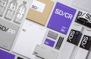
Result – The new logo is used in a vast range of visual materials for the school, including website, brochures, report cards, bags, classroom signage’s, uniform emblems, stationary etc.


